The quilt I did is the one hanging in the background. It's cute but Mom and I agreed that it would look neat in brighter colors. Much against her style, she asked that I do it in Jason Yenter's Bloom Modern II.
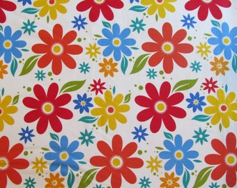
The focus print
A "closer"-up of the sample quilt
So here is what we ended up with. Seeing the original, and then the sample...I think it looks great either way. That, I feel, is a testament to a successful pattern design - that it will look good in different color styles.


Love it! It's so very cute!
ReplyDeleteNot sure if it's my computer or not, but the first image isn't showing up for me.