

The quilt I did is the one hanging in the background. It's cute but Mom and I agreed that it would look neat in brighter colors. Much against her style, she asked that I do it in Jason Yenter's Bloom Modern II.
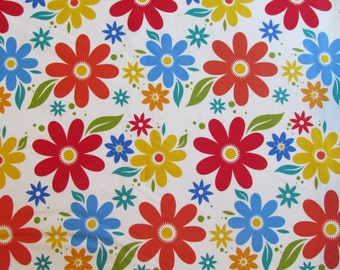
The focus print

A "closer"-up of the sample quilt
So here is what we ended up with. Seeing the original, and then the sample...I think it looks great either way. That, I feel, is a testament to a successful pattern design - that it will look good in different color styles.


