Color Theory is a term we hear pop up a lot in the art world, and now it's found a place as a buzz phrase in the quilting community. It sounds like an unnecessary complication to a pretty straight forward concept - choosing colors you like and that look good together and putting them in a quilt - but knowing how color works and how colors interact in an art piece can prove to be a valuable asset in quilt making, making your already beautiful quilts that much stronger.
Since we're all starting from different experience levels, I'm going to explain Color Theory from the ground up; I'm not insulting anyone's intelligence, I promise, I'm just going to lay it all out so everyone starts on the same page.
Color Basics
Even if you don't do traditional art or quilt, you still know something about color even if you don't readily recognize it. Think about it for a minute: what's your favorite color? Is there a color pairing you find yourself buying a lot of for your home or wardrobe? If you can dress yourself, then you can pick color. Most of us (People of Walmart not included) have a reasonably good idea of what colors look good on us (for me, jewel tones), what does nothing for us (for me, white and beige) and what looks downright God-awful (I'm looking at you, yellow). Women especially have a good idea of color because most of us at least ever now and then, wear makeup. We have to know if we have a warm or cool toned skin tone, if we're an "ivory, buff, beige, tan, olive, or ebony," which eyeshadow will make our blue/brown/green/hazel/grey eyes look more blue/brown/green/hazel/grey, and whether our lipstick will make our teeth look white or yellow based on whether the lipstick is yellow based or blue based. Guys, you know color too! You carefully select your tie to match your suit to match your hankercheif to match your shoes, your car's exterior to match the interior to match the speakers, your customizable video game and RPG characters to look the most menacing ro the most sage (you can't have an anti-Paladin in pink...that's not menacing and manly at all).
But just to review the color basics we all ready know...
Warm Colors - Red, orange and yellow are traditionally called the warm colors. Browns, tans, even some purples and blacks can be considered warm colors if they're red or yellow based. But that's overcomplicating it, and we'll get to that later. Warm colors all share their primary base of red. We know the warm colors give a more bright, energetic, alarming, cheerful feel to whatever they are covering.
Cool Colors - Traditionally, these are green, blue and purple. Grey, brown, black and beige can also be cool colors if they are blue or green based. Cool colors all share the primary blue base. These are called cool colors since when they are used, they evoke feelings of calmness, coldness, crispness and freshness that warm colors contrast with.
POP QUIZ! True or False: Black is all colors combined and white is the absence of color, so therefore there is only one black and one white - they're all the same. Read on for the answer...
Remember this? I think we all had to make our own version of this in grade school using too much tempera paint and glitter.
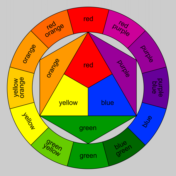
Hues
The above Color Wheel is showing the hues only. A hue is the pure color, meaning it is not mixed with gray, black or white to achieve darker, lighter, duller or brighter colors. You've probably also noticed that brown, grey, black and white are NOT shown on the Color Wheel. All of that I will explain later, but first, let's just focus on the hues.
Primary - The primary colors are the three that make up the very center of the Color Wheel; Red, yellow and blue. These three colors are the very base of all other colors, which means they also are the least complex (yes, even white and black are more complex than your primary red, yellow and blue. I'll get to the different types of the primaries later). These 3 colors are not the result of mixing any other colors, meaning you can't mix X and Y and get red for example.
Secondary - The colors are the result of mixing any 2 of the 3 primary colors; red + yellow yields orange, yellow+ blue yields green and blue + red yields violet. Secondary colors are still fairly pure, meaning they are the result of your most basic primaries, not dark red + light blue or anything like that.
Tertiary - These colors are a little more complex. I refer to these as the Crayola colors; these are the Violet-Reds, Red-Violets, Yellow-Greens, Blue-Purples...all of the least creatively named, yet prettiest (in my opinion) crayons of the Crayola 24 pack. These colors are achieved by mixing one primary color and one secondary color, so they end up being the "in-between" colors, not quite one or the other. This is one way to get your darks and brights of secondary colors.
How does knowing Hues help in quilting?
Knowing the hues helps a great deal. Think of the hue of the color as the foundation of your house. Your house needs a foundation to be built on, just like your quilt needs color to grow from. By knowing how a hue is built and where it sits on the Color Wheel, you can more easily choose the colors to go with it. Each hue has a built in set of colors it naturally looks nice with, both yielding different visual effects: the accompanying colors can either be Analogous or Complementary.
For the sake of example, let's say I am making a quilt and I have chosen a focus fabric that is predominantly violet:
Analogous - Analogous colors are the colors that are immediately next to each other on the Color Wheel, and are made up of one primary, one secondary and one tertiary. Sonce my focus fabric is purple, my analogous color set could either be red, red-violet and violet or blue, purple (aka blue-violet) and violet. Analogous colors in quilts create a softer, calmer more blended appearance (even if your focus is yellow)since they are all in the same color family.
Complementary - Complementary colors are the colors that are opposite each other on the Color Wheel. Looking at the above Color Wheel, you can see that Violet's complement is yellow. When you're dealing with hues, complementary colors are a pairing of one primary and one secondary, or a pairing of two tertiaries, depending on your color choice. In quilts, it is the Complementary pairings that give your quilt pop! The opposite colors make each other brighter and more intense, which gives your quilt a brighter and more dynamic quilt. Complementary colors can be expanded into analogous complemntary pairings in quilts, meaning you pair your focus analogous set (let's say red, red-violet and violet ) with their complementary analogous set (yellow, yellow-green and green). Using Complementary Analgous pairs gives you a wider range of color, while toning down the intensity of your complements, still gives your quilt what I call "the pop factor." If you mix two complemenatry colors together, however, you will get a muddy shade of grey-brown. This is useful if you need a brown that plays well with your complements.
Now we're going to get a little more complicated, because we'll combine the above principles with some new mixes of color. Expand your idea of the Color Wheel from that of the simple Hue Color Wheel you learned in grade school into what I call "The Paint Chip Color Wheel" that you'd learn in art school. This is where we bring in the lights, darks, brights and neutrals together into one Color Wheel, as illustrated below. Since we just went through Hues, we're going to skip those and dive right in:

The Truth About Black and White
True or False: Black is all colors combined and white is the absence of color, so therefore there is only one black and one white - they're all the same.
Answer: FALSE. While it is true that black is all colors combined and white is the absence of color, it is not true that all balcks and all whites are same. Both colors are actually multi-tonal.
Have you ever put on a black shirt and a black pair of pants, walked outside and had someone point out your shirt and pants didn't match? Though tactless, it was probably true. When it comes to fabrics, not every black is the same. Different companies used different types of dye with different base colors to make their black dye. Go into any quilt store and grab a few different brands of solid black; I guarantee you one will look warmer (red base) and one will look cooler (blue base) and one will look slightly greenish (green base). They're all black, but they have different bases. Dabbing some bleach on a piece of black fabric will show you what it's base color is if you have enough fabric to spare to test. Not only that, but because of their different bases, blacks come in a variety of shades evenwithout the addition of white: blue based blacks tend to be the darkest, and green based blacks tend to be lighter.
White functions a little differently. Think of it in terms of a white paint chip - there's bright white, soft white, eggshell white. They are all white and like black, unless you put 2 different whites together, its hard to tell the difference. In fabric, there is even something called "optic white," which is the white that is the brightest of them all. The softer whites work well in pastel quilts and in lanscape quilts where white is necessary. While still creating high contrast with other colors, it's not as stark as an optic white. Optic whites work nicely in more contemporary quilts and in quilts using brights. It creates the crispest line and the highest contrast. Natural light aids in determining what kind of white you have, since artificial (incandescent, fluorescent, LED etc) light can give fabric a slight cast of color it may or may not have on its own.
Tints
As you can see above, a Tint is the hue mixed with white. This is what we commonly refer to as the Pastel colors. The more white a hue is mixed with, the lighter and brighter the color becomes. This is also how we get our lightest of neutrals - cream, buff, beige - but I'll get to how we achieve our neutrals in a moment. Tints may also be mixed with other tints to creat new tints. Whew!

The same Warm/Cool, Analogous/Complementary (WC/AC Rules henceforth) apply to Tints as to Hues. Used alone, Tints provide quilts with a very soft, light, gentle, feminine look and feel, regardless of texture. These are perfect colors for baby, spring, winter, shabby chic, and girly girl quilts. When accompanying other non-Tint colors, they traditionally are used as backgrounds or to give the impression of light.
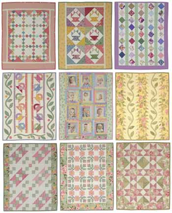
Examples of quilts using Tints. Tints don't have to be baby pastel, it just depends on how much white is present in the hue that determines how pastel it reads. Picture courtesy of Lori Smith of From My Heart to Your Hands
Tones
Tones are hues mixed with gray. Gray is not a tone; keep in mind that gray is white + black, which makes it technically a tint, and black is multi-colored. That means that since there are just about endless colors of gray (sounds odd, colors of gray, doesn't it?) because of the different blacks the white could get mixed with, Tones actually have a deceptively broad range of color. Depending on who you talk to, this is where you'll find your Neutrals. I disagree there, since not all (in fact, to my eye, not most) Neutrals are mixes of gray - they are more complex than that.
 Tones - Hue to the left, tone to the right. Courtesy of Tiger Color
Again, the same Warm/Cool, Analogous/Complementary (WC/AC Rules henceforth) apply to Tones as well. Tones make for great additions to masculine quilts, and are extremely useful in creating shadow and depth for landscape quilts. They also offset bright colors very well, and give those colors a "glowing" effect. Tones are also prevalent in Primitives and reproduction style quilts.
Again, the same Warm/Cool, Analogous/Complementary (WC/AC Rules henceforth) apply to Tones as well. Tones make for great additions to masculine quilts, and are extremely useful in creating shadow and depth for landscape quilts. They also offset bright colors very well, and give those colors a "glowing" effect. Tones are also prevalent in Primitives and reproduction style quilts.

This is an example of a tonal/neutral quilt. The focus is gray, taupe and brown, with taupe being the prime example of a Tonal color (brown + gray). Photo courtesy of Quilts in Montana.
Shades
"Shade" is a word we use colloquially to denote the different colors within a color (shades of pink, shades of blue etc) that aren't necessarily dark, light or mid-tone. However, in Color Theory, a shade is a color that is mixed with black, making it the dark version of that color. Just like with Tones, because black is multi-colored, the effect can be whide ranging, from intensifying it to a dark, rich color (for example, mixing red with a red-based black), or to counteract the warmness/coolness of it (for example, mixing a red with a green based black). Shades can range from just slightly darker than mid-tone, to almost black, depending on how much black is mixed with the original color, but generally they are referred to as "dark [color of choice]."

Shades are great for pairing with brighter colors to make them pop, or pairing with other shades to create a sense of depth and richness. They work very well in masculine quilts and contemporary quilts, and are prevalent in reproductions and Primitives.
Shades - Hue to the left, shaded to the right. Courtesy of Tiger Color
Shades are great for pairing with brighter colors to make them pop, or pairing with other shades to create a sense of depth and richness. They work very well in masculine quilts and contemporary quilts, and are prevalent in reproductions and Primitives.

This is a good example of shades and tonals. The lighter pieces are a tonal (taupe-gray) and the rest are shades of red, blue, rust and looks like green too. The quilt is beautifully rich. Picture courtesy of Heather Pearson's Blog.
Making Color Work FOR You
Choosing color for your quilt is not a scary as it can be made out to be. Thankfully, unlike paint, if you don't like a color you put in, or if it just doesn't work, you can take the piece out and put a new one in relatively easily. But a good rule of thumb is to start with a focus fabric that will be prevalent in your quilt, from which you can choose accompnying colors. Sometimes it's obvious which colors you want to put with your piece, and it's a snap and you get your colors picked in 5 minutes or less. They work great, and Voila! Successful quilt. This is more for when you have a focus fabric, or a set of colors you think you awant but are stumped as to what to put with it.
First, there are a couple things to consider. What kind of fibers will you be working with - cotton, batiks, flannel, wool, silk, wovens, etc? This is important to consider since some fibers absorb dye differently. Batiks and cottons tend to be more saturated with dye, and so they run the gamut from pastel to bright to dark with ease. Flannels can be bright, but more often than not you'll find darker, more muted colors or very soft pastel colors. Wool comes in all colors, but darker and brighter colors are more prevalent. Wovens tend to be more neutral and tonal.
Another question to ask yourself is, what do you want to achieve with your quilt? That will help determine your color selection. If you are looking to make a comfort quilt, you might shy away from the brighter, more intense colors and opt for something softer and more soothing. If you are looking to do something more contemporary, you might look more into the brights and tonals. If reproduction is your thing, you might seek out deeper and more tonal fabrics. Pastels are more suited for shabby chic, spring and baby quilts, so you might consider pastels for something like that. THERE IS NO HARD AND FAST RULE AS TO WHAT IS THE "RIGHT" COLOR FOR THE JOB. I cannot emphsize that enough! There are no Quilt Police that will haul you away for doing a baby quilt in tonals, a reproduction in pastels or a traditional quilt in brights. Consider who you're making it for, and what they like and what purpose it will serve. Everyone has a different eye and likes different things so COLOR CHOICE IS SUBJECTIVE. It's no fun if theres stress and anxiety over what's the correct color for the jo, it's all about what flows and looks good to your eye and Color Theory helps you get there. I digress :)
Here's a breakdown of colors and the effects they acheive on their own. When you combine them in certain ways, they bounce off each other differently:
Red: An active color, red will pop out from darker, cooler colors. It has warm intensity and brings to mind things like fire, love.
Orange: Also an active color, it pops from darker, cooler colors as well. It is warm and bright and gives quilts a happy, sunny, energetic feel.
Yellow: An active and intense color that will pop against any other, even warm colors. It is warm, crispand vibrant. the eye cannot focus on yellow for very long, so placing pops of yellow in a quilt forces the eye to move around the piece. It also gives quilts a cheerful and sunny feel.
Green: This is generally a more passive color that retreats when placed with warmer colors, but if the hue/tint is bright enough, it can pop depending on what it is placed with. Green helps give quilts a fresh, clean and calm ambiance.
Blue: Unless it is a very bright blue paired with other cool colors, blue is a passive color that retreats in the background. It will give your quilt a tranquil feel no matter the shade, and in the tonals it grounds the piece. Blue can be vibrant and energetic, but overall it is a calming influence.
Purple: As with green, the intensity and brightness of purple can change whether it pops or retreats. Generally though, it retreats and gives the quilt a fresh, feminine, or rich and regal feel.
Neutrals: I'm going ot go ahead an use this umbrella term for browns, grays, beiges, taupes, tans, creams and everything inbetween. Neutrals tend to recede because they are mostly paired with a more dominant color. They give quilts a calm, earthy simple beauty.
White: White quickly dominates a quilt, but if used too much it has a tendency to overpower the colors it's paired with. Colors appear less bright with white with them, but also appear fresher and clearer than with black, as seen below:

Black: As seen above, black makes other colors, including white, pop. Because of its darkness, it dominates a quilt. visually while still letting other fabrics be the stars.


Here are some color choice tips to consider...
* Depending on what you choose to use as a background, the color you use on top of it may look different because of how the two colors play together based on where they are located on the color wheel. For example:The center block in each square is the same red, but look how different it can look based on what you pair with it? Courtesy of Color Matters
Again, the center block is the same purple, buyt even with analogous colors, the focus color can seemingly change based on your background. Courtesy of Color Matters
* Color is important, but value is even moreso. You can have all of the range of color in the world but still have a flat quilt if it's all the same tint/tone/shade. Quilts need light, medium and dark fabrics to create depth. that doesn't mean every quilt needs black and white, but in whatever colors you choose, having both ends of the spectrum as well as the mid tone helps create richness, depth and that "Pop Factor" that quilters love.
* Cooler, darker colors tend to recede when places with brighter, warmer colors. If you want a portion of your block to pop, consider using the brighter complement as the focus of that block.
* Monochromatic (using the hue, tints, tones and shades of one color only) quilts are nothing to sneeze at. While only using one color, the value is what makes the quilt so visually impactful.
* Proportion of color and value is what gives your quilt its life - The dominant color is both the color you use the most of, or what your eye is drawn to quickest. Your sub-dominant colors are the colors that take up less area than the dominant color, but play well with the dominant. The accent is the color that takes up the least space, but contrasts the most with the sub-dominant and dominant color(s). Divinding your color choices into those groups can help organize and guide the direction of your quilt. Without stating it outright, most quilt patterns do this for you on the required yardage page.
* This Palette Picker is a great help to illustrate how your colors will interact if you're having a hard time visualizing. It's come in handy for me more than once!
This article has been supplemented by this Color Theory website. If you want to learn even more, this is the best, most in-depth tutorial I have found yet
No comments:
Post a Comment
I welcome all comments and constructive criticism! All I ask is that you keep it clean and keep it kind.