Color Theory seems to be the name of the game lately. On Monday I taught the Color Theory class at The Cotton Patch, and man I wish I would have seen this before the class!
This website talks about gender biases to color, and how men and women see color differently. A very interesting read!
Showing posts with label Color. Show all posts
Showing posts with label Color. Show all posts
Tuesday, January 31, 2012
Tuesday, September 27, 2011
This is the best Color Theory site I have ever seen.
Remember way back when...a couple weeks ago...I posted an article going through the ins and outs of Color Theory for Quilters? Well this site, Color Scheme Designer 3 is the best color scheme generator I have seen yet. It uses the color wheel, so you click on the color you want and you have the ability to choose the see the color schemes in your color of choice - Analogous, Complementary, Triads, Tetrads, Analogic and Accented Analogic. I only explained Analogous and Complementary in my article, but if you look at the icon you'll quickly figure out what the others are. So say you have a focus fabric that is dominantly one color family; pop those dominant colors in thier color wheel and see what other "pop" colors you have at your disposal, or which will blend best before you spend the hours agonizing over choocing go withs. I know I'll be using this site a lot in the future. Oh, and did I mention it has specific color wheels designed for color blindness? So for my color blind readers and all the color blind quilters out there (I don't mean that facetiously; there really are quilters who suffer from color blindness and their quilts turn out wonderfully) who are feeling insecure about color choice, this is defintely worth a look. Choose your type of color blindness from the menu and it will take you to a color wheel that reflects what you see. How cool is that?!
Seriously. Give the Color Scheme Designer 3 a try! You won't be disappointed.
Seriously. Give the Color Scheme Designer 3 a try! You won't be disappointed.
Thursday, September 8, 2011
Thursday: It's Technical. Color Theory and Color Choice in Quilts
When I was an art student, and somehow the topic of conversation go to that point, I'd say 70% of the time the response was "Oh, I could never do that, I can't draw and I don't know anything about color." Now that I work in a quilt shop, people come in all the time asking for help with color choices, usually followed by "I just can't put colors together." Don't get me wrong, I love helping people with their color choices, I think it's the most fun part of the quilting process! But this post is about empowering people to love and not fear their color choices by showing how easy color can be!
Color Theory is a term we hear pop up a lot in the art world, and now it's found a place as a buzz phrase in the quilting community. It sounds like an unnecessary complication to a pretty straight forward concept - choosing colors you like and that look good together and putting them in a quilt - but knowing how color works and how colors interact in an art piece can prove to be a valuable asset in quilt making, making your already beautiful quilts that much stronger.
Since we're all starting from different experience levels, I'm going to explain Color Theory from the ground up; I'm not insulting anyone's intelligence, I promise, I'm just going to lay it all out so everyone starts on the same page.
Color Basics
Even if you don't do traditional art or quilt, you still know something about color even if you don't readily recognize it. Think about it for a minute: what's your favorite color? Is there a color pairing you find yourself buying a lot of for your home or wardrobe? If you can dress yourself, then you can pick color. Most of us (People of Walmart not included) have a reasonably good idea of what colors look good on us (for me, jewel tones), what does nothing for us (for me, white and beige) and what looks downright God-awful (I'm looking at you, yellow). Women especially have a good idea of color because most of us at least ever now and then, wear makeup. We have to know if we have a warm or cool toned skin tone, if we're an "ivory, buff, beige, tan, olive, or ebony," which eyeshadow will make our blue/brown/green/hazel/grey eyes look more blue/brown/green/hazel/grey, and whether our lipstick will make our teeth look white or yellow based on whether the lipstick is yellow based or blue based. Guys, you know color too! You carefully select your tie to match your suit to match your hankercheif to match your shoes, your car's exterior to match the interior to match the speakers, your customizable video game and RPG characters to look the most menacing ro the most sage (you can't have an anti-Paladin in pink...that's not menacing and manly at all).
But just to review the color basics we all ready know...
Warm Colors - Red, orange and yellow are traditionally called the warm colors. Browns, tans, even some purples and blacks can be considered warm colors if they're red or yellow based. But that's overcomplicating it, and we'll get to that later. Warm colors all share their primary base of red. We know the warm colors give a more bright, energetic, alarming, cheerful feel to whatever they are covering.
Cool Colors - Traditionally, these are green, blue and purple. Grey, brown, black and beige can also be cool colors if they are blue or green based. Cool colors all share the primary blue base. These are called cool colors since when they are used, they evoke feelings of calmness, coldness, crispness and freshness that warm colors contrast with.
POP QUIZ! True or False: Black is all colors combined and white is the absence of color, so therefore there is only one black and one white - they're all the same. Read on for the answer...
Remember this? I think we all had to make our own version of this in grade school using too much tempera paint and glitter.
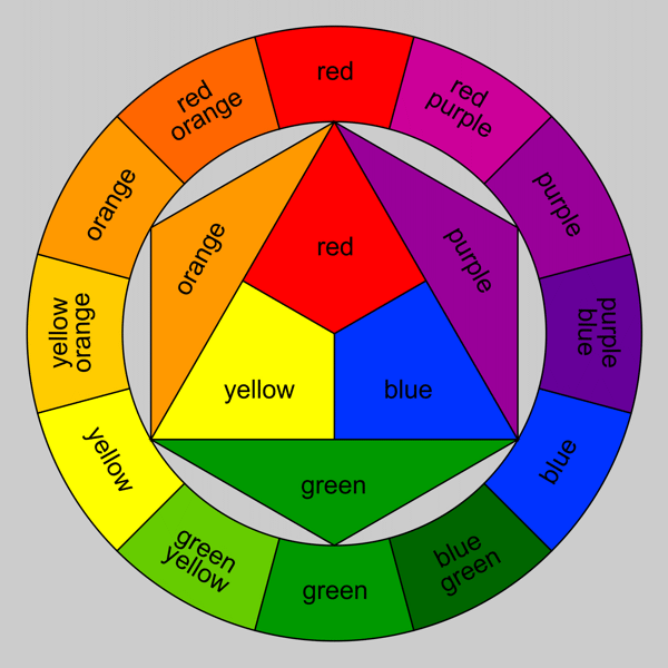
Hues
The above Color Wheel is showing the hues only. A hue is the pure color, meaning it is not mixed with gray, black or white to achieve darker, lighter, duller or brighter colors. You've probably also noticed that brown, grey, black and white are NOT shown on the Color Wheel. All of that I will explain later, but first, let's just focus on the hues.
Primary - The primary colors are the three that make up the very center of the Color Wheel; Red, yellow and blue. These three colors are the very base of all other colors, which means they also are the least complex (yes, even white and black are more complex than your primary red, yellow and blue. I'll get to the different types of the primaries later). These 3 colors are not the result of mixing any other colors, meaning you can't mix X and Y and get red for example.
Secondary - The colors are the result of mixing any 2 of the 3 primary colors; red + yellow yields orange, yellow+ blue yields green and blue + red yields violet. Secondary colors are still fairly pure, meaning they are the result of your most basic primaries, not dark red + light blue or anything like that.
Tertiary - These colors are a little more complex. I refer to these as the Crayola colors; these are the Violet-Reds, Red-Violets, Yellow-Greens, Blue-Purples...all of the least creatively named, yet prettiest (in my opinion) crayons of the Crayola 24 pack. These colors are achieved by mixing one primary color and one secondary color, so they end up being the "in-between" colors, not quite one or the other. This is one way to get your darks and brights of secondary colors.
How does knowing Hues help in quilting?
Knowing the hues helps a great deal. Think of the hue of the color as the foundation of your house. Your house needs a foundation to be built on, just like your quilt needs color to grow from. By knowing how a hue is built and where it sits on the Color Wheel, you can more easily choose the colors to go with it. Each hue has a built in set of colors it naturally looks nice with, both yielding different visual effects: the accompanying colors can either be Analogous or Complementary.
For the sake of example, let's say I am making a quilt and I have chosen a focus fabric that is predominantly violet:
Analogous - Analogous colors are the colors that are immediately next to each other on the Color Wheel, and are made up of one primary, one secondary and one tertiary. Sonce my focus fabric is purple, my analogous color set could either be red, red-violet and violet or blue, purple (aka blue-violet) and violet. Analogous colors in quilts create a softer, calmer more blended appearance (even if your focus is yellow)since they are all in the same color family.
Complementary - Complementary colors are the colors that are opposite each other on the Color Wheel. Looking at the above Color Wheel, you can see that Violet's complement is yellow. When you're dealing with hues, complementary colors are a pairing of one primary and one secondary, or a pairing of two tertiaries, depending on your color choice. In quilts, it is the Complementary pairings that give your quilt pop! The opposite colors make each other brighter and more intense, which gives your quilt a brighter and more dynamic quilt. Complementary colors can be expanded into analogous complemntary pairings in quilts, meaning you pair your focus analogous set (let's say red, red-violet and violet ) with their complementary analogous set (yellow, yellow-green and green). Using Complementary Analgous pairs gives you a wider range of color, while toning down the intensity of your complements, still gives your quilt what I call "the pop factor." If you mix two complemenatry colors together, however, you will get a muddy shade of grey-brown. This is useful if you need a brown that plays well with your complements.
Now we're going to get a little more complicated, because we'll combine the above principles with some new mixes of color. Expand your idea of the Color Wheel from that of the simple Hue Color Wheel you learned in grade school into what I call "The Paint Chip Color Wheel" that you'd learn in art school. This is where we bring in the lights, darks, brights and neutrals together into one Color Wheel, as illustrated below. Since we just went through Hues, we're going to skip those and dive right in:
The Truth About Black and White
True or False: Black is all colors combined and white is the absence of color, so therefore there is only one black and one white - they're all the same.
Answer: FALSE. While it is true that black is all colors combined and white is the absence of color, it is not true that all balcks and all whites are same. Both colors are actually multi-tonal.
Have you ever put on a black shirt and a black pair of pants, walked outside and had someone point out your shirt and pants didn't match? Though tactless, it was probably true. When it comes to fabrics, not every black is the same. Different companies used different types of dye with different base colors to make their black dye. Go into any quilt store and grab a few different brands of solid black; I guarantee you one will look warmer (red base) and one will look cooler (blue base) and one will look slightly greenish (green base). They're all black, but they have different bases. Dabbing some bleach on a piece of black fabric will show you what it's base color is if you have enough fabric to spare to test. Not only that, but because of their different bases, blacks come in a variety of shades evenwithout the addition of white: blue based blacks tend to be the darkest, and green based blacks tend to be lighter.
White functions a little differently. Think of it in terms of a white paint chip - there's bright white, soft white, eggshell white. They are all white and like black, unless you put 2 different whites together, its hard to tell the difference. In fabric, there is even something called "optic white," which is the white that is the brightest of them all. The softer whites work well in pastel quilts and in lanscape quilts where white is necessary. While still creating high contrast with other colors, it's not as stark as an optic white. Optic whites work nicely in more contemporary quilts and in quilts using brights. It creates the crispest line and the highest contrast. Natural light aids in determining what kind of white you have, since artificial (incandescent, fluorescent, LED etc) light can give fabric a slight cast of color it may or may not have on its own.
Tints
As you can see above, a Tint is the hue mixed with white. This is what we commonly refer to as the Pastel colors. The more white a hue is mixed with, the lighter and brighter the color becomes. This is also how we get our lightest of neutrals - cream, buff, beige - but I'll get to how we achieve our neutrals in a moment. Tints may also be mixed with other tints to creat new tints. Whew!

The same Warm/Cool, Analogous/Complementary (WC/AC Rules henceforth) apply to Tints as to Hues. Used alone, Tints provide quilts with a very soft, light, gentle, feminine look and feel, regardless of texture. These are perfect colors for baby, spring, winter, shabby chic, and girly girl quilts. When accompanying other non-Tint colors, they traditionally are used as backgrounds or to give the impression of light.
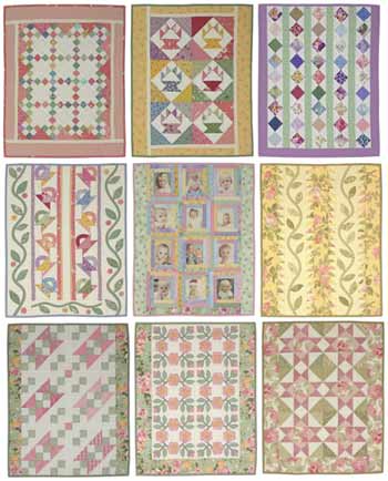
Examples of quilts using Tints. Tints don't have to be baby pastel, it just depends on how much white is present in the hue that determines how pastel it reads. Picture courtesy of Lori Smith of From My Heart to Your Hands
Tones
Tones are hues mixed with gray. Gray is not a tone; keep in mind that gray is white + black, which makes it technically a tint, and black is multi-colored. That means that since there are just about endless colors of gray (sounds odd, colors of gray, doesn't it?) because of the different blacks the white could get mixed with, Tones actually have a deceptively broad range of color. Depending on who you talk to, this is where you'll find your Neutrals. I disagree there, since not all (in fact, to my eye, not most) Neutrals are mixes of gray - they are more complex than that.
 Tones - Hue to the left, tone to the right. Courtesy of Tiger Color
Again, the same Warm/Cool, Analogous/Complementary (WC/AC Rules henceforth) apply to Tones as well. Tones make for great additions to masculine quilts, and are extremely useful in creating shadow and depth for landscape quilts. They also offset bright colors very well, and give those colors a "glowing" effect. Tones are also prevalent in Primitives and reproduction style quilts.
Again, the same Warm/Cool, Analogous/Complementary (WC/AC Rules henceforth) apply to Tones as well. Tones make for great additions to masculine quilts, and are extremely useful in creating shadow and depth for landscape quilts. They also offset bright colors very well, and give those colors a "glowing" effect. Tones are also prevalent in Primitives and reproduction style quilts.
This is an example of a tonal/neutral quilt. The focus is gray, taupe and brown, with taupe being the prime example of a Tonal color (brown + gray). Photo courtesy of Quilts in Montana.
Shades
"Shade" is a word we use colloquially to denote the different colors within a color (shades of pink, shades of blue etc) that aren't necessarily dark, light or mid-tone. However, in Color Theory, a shade is a color that is mixed with black, making it the dark version of that color. Just like with Tones, because black is multi-colored, the effect can be whide ranging, from intensifying it to a dark, rich color (for example, mixing red with a red-based black), or to counteract the warmness/coolness of it (for example, mixing a red with a green based black). Shades can range from just slightly darker than mid-tone, to almost black, depending on how much black is mixed with the original color, but generally they are referred to as "dark [color of choice]."

Shades are great for pairing with brighter colors to make them pop, or pairing with other shades to create a sense of depth and richness. They work very well in masculine quilts and contemporary quilts, and are prevalent in reproductions and Primitives.
Shades - Hue to the left, shaded to the right. Courtesy of Tiger Color
Shades are great for pairing with brighter colors to make them pop, or pairing with other shades to create a sense of depth and richness. They work very well in masculine quilts and contemporary quilts, and are prevalent in reproductions and Primitives.
This is a good example of shades and tonals. The lighter pieces are a tonal (taupe-gray) and the rest are shades of red, blue, rust and looks like green too. The quilt is beautifully rich. Picture courtesy of Heather Pearson's Blog.
Making Color Work FOR You
Choosing color for your quilt is not a scary as it can be made out to be. Thankfully, unlike paint, if you don't like a color you put in, or if it just doesn't work, you can take the piece out and put a new one in relatively easily. But a good rule of thumb is to start with a focus fabric that will be prevalent in your quilt, from which you can choose accompnying colors. Sometimes it's obvious which colors you want to put with your piece, and it's a snap and you get your colors picked in 5 minutes or less. They work great, and Voila! Successful quilt. This is more for when you have a focus fabric, or a set of colors you think you awant but are stumped as to what to put with it.
First, there are a couple things to consider. What kind of fibers will you be working with - cotton, batiks, flannel, wool, silk, wovens, etc? This is important to consider since some fibers absorb dye differently. Batiks and cottons tend to be more saturated with dye, and so they run the gamut from pastel to bright to dark with ease. Flannels can be bright, but more often than not you'll find darker, more muted colors or very soft pastel colors. Wool comes in all colors, but darker and brighter colors are more prevalent. Wovens tend to be more neutral and tonal.
Another question to ask yourself is, what do you want to achieve with your quilt? That will help determine your color selection. If you are looking to make a comfort quilt, you might shy away from the brighter, more intense colors and opt for something softer and more soothing. If you are looking to do something more contemporary, you might look more into the brights and tonals. If reproduction is your thing, you might seek out deeper and more tonal fabrics. Pastels are more suited for shabby chic, spring and baby quilts, so you might consider pastels for something like that. THERE IS NO HARD AND FAST RULE AS TO WHAT IS THE "RIGHT" COLOR FOR THE JOB. I cannot emphsize that enough! There are no Quilt Police that will haul you away for doing a baby quilt in tonals, a reproduction in pastels or a traditional quilt in brights. Consider who you're making it for, and what they like and what purpose it will serve. Everyone has a different eye and likes different things so COLOR CHOICE IS SUBJECTIVE. It's no fun if theres stress and anxiety over what's the correct color for the jo, it's all about what flows and looks good to your eye and Color Theory helps you get there. I digress :)
Here's a breakdown of colors and the effects they acheive on their own. When you combine them in certain ways, they bounce off each other differently:
Red: An active color, red will pop out from darker, cooler colors. It has warm intensity and brings to mind things like fire, love.
Orange: Also an active color, it pops from darker, cooler colors as well. It is warm and bright and gives quilts a happy, sunny, energetic feel.
Yellow: An active and intense color that will pop against any other, even warm colors. It is warm, crispand vibrant. the eye cannot focus on yellow for very long, so placing pops of yellow in a quilt forces the eye to move around the piece. It also gives quilts a cheerful and sunny feel.
Green: This is generally a more passive color that retreats when placed with warmer colors, but if the hue/tint is bright enough, it can pop depending on what it is placed with. Green helps give quilts a fresh, clean and calm ambiance.
Blue: Unless it is a very bright blue paired with other cool colors, blue is a passive color that retreats in the background. It will give your quilt a tranquil feel no matter the shade, and in the tonals it grounds the piece. Blue can be vibrant and energetic, but overall it is a calming influence.
Purple: As with green, the intensity and brightness of purple can change whether it pops or retreats. Generally though, it retreats and gives the quilt a fresh, feminine, or rich and regal feel.
Neutrals: I'm going ot go ahead an use this umbrella term for browns, grays, beiges, taupes, tans, creams and everything inbetween. Neutrals tend to recede because they are mostly paired with a more dominant color. They give quilts a calm, earthy simple beauty.
White: White quickly dominates a quilt, but if used too much it has a tendency to overpower the colors it's paired with. Colors appear less bright with white with them, but also appear fresher and clearer than with black, as seen below:
Black: As seen above, black makes other colors, including white, pop. Because of its darkness, it dominates a quilt. visually while still letting other fabrics be the stars.


Here are some color choice tips to consider...
* Depending on what you choose to use as a background, the color you use on top of it may look different because of how the two colors play together based on where they are located on the color wheel. For example:The center block in each square is the same red, but look how different it can look based on what you pair with it? Courtesy of Color Matters
Again, the center block is the same purple, buyt even with analogous colors, the focus color can seemingly change based on your background. Courtesy of Color Matters
* Color is important, but value is even moreso. You can have all of the range of color in the world but still have a flat quilt if it's all the same tint/tone/shade. Quilts need light, medium and dark fabrics to create depth. that doesn't mean every quilt needs black and white, but in whatever colors you choose, having both ends of the spectrum as well as the mid tone helps create richness, depth and that "Pop Factor" that quilters love.
* Cooler, darker colors tend to recede when places with brighter, warmer colors. If you want a portion of your block to pop, consider using the brighter complement as the focus of that block.
* Monochromatic (using the hue, tints, tones and shades of one color only) quilts are nothing to sneeze at. While only using one color, the value is what makes the quilt so visually impactful.
* Proportion of color and value is what gives your quilt its life - The dominant color is both the color you use the most of, or what your eye is drawn to quickest. Your sub-dominant colors are the colors that take up less area than the dominant color, but play well with the dominant. The accent is the color that takes up the least space, but contrasts the most with the sub-dominant and dominant color(s). Divinding your color choices into those groups can help organize and guide the direction of your quilt. Without stating it outright, most quilt patterns do this for you on the required yardage page.
* This Palette Picker is a great help to illustrate how your colors will interact if you're having a hard time visualizing. It's come in handy for me more than once!
This article has been supplemented by this Color Theory website. If you want to learn even more, this is the best, most in-depth tutorial I have found yet
Tuesday, September 6, 2011
Some Finished Projects, and Tippy Tuesday!
Well, it's been QUITE the weekend. I can honestly say I pushed myself to the point of being so physically and mentally tired I couldn't think of the word for guacamole (and I love guacamole). We changed the store up...just about the only things that didn't move are Color Wall and Clearance. It looks pretty dang good if I do say so myself, but it was a LOT of hard work. Mom is notorious for pushing herself too hard, and so considering a week off of her heart attack she was wanting to move things, I made sure I stayed late and came in early so I got the heavy lifting done before she got there so she wouldn't try to do it herself. Who'd have thought that there would be heavy lifting in a quilt store? Well, there is...those bolts are heavy if you move more than 2 at a time (which I did). But it wasn't all me thank goodness, we got my folks, my aunt, brother and my roomate to help get things done and after 3 days of moving I swear I couldn't have done it without their help! The busted their rear ends too and for that I thank 'em. So y'all will have to come in and see!
Besides doing the big fall floorset, I got a couple quilts done too. The first is a quilt from posts past. I finally got the borders on and it looks fabulous! It was really hard for me to do a random and scrappy style quilt, especially one that is really heavy on pattern, so I'm happy with the results. We were going to have kits for this, but when I discovered how the borders had to be cut to look right, it just wasn't going to happen. So, just about all of the fabric is still available, but no kits.


Besides doing the big fall floorset, I got a couple quilts done too. The first is a quilt from posts past. I finally got the borders on and it looks fabulous! It was really hard for me to do a random and scrappy style quilt, especially one that is really heavy on pattern, so I'm happy with the results. We were going to have kits for this, but when I discovered how the borders had to be cut to look right, it just wasn't going to happen. So, just about all of the fabric is still available, but no kits.

The whole kit 'n caboodle. Scrappy, yes?

A detail shot. I am in LOVE with that border print. It's a strong pastel, which, any pastel isn't really my thing, but this one is really cute. And it's a sewing theme too so it's gotta be good ;-) In case you're wondering, the beige in the print is actually a sewing pattern for clothes, the kind that comes printed on the it's-so-thin-you-look-at-it-sideways-and-it-tears tissue paper. It's a little hard to see in this picture.

A detail of the ceter of the quilt. And my feet.
The other quilt is a quilt from a postcard pattern. They're $2 apiece and all of the quilts are simple and of various sizes, from wall hangings to very large throws (this one is I think about 74" square). I started this in January and obviously got very, very sidetracked. But it turned out nicely, and it's definitely in my favorite colorway.
Simple, but it's one of those quilts where color and value placement make a world of difference. This quilt could look completely different by turning the blocks different ways and placing the color differently.
A little more detail of the fabric, sans feet. I am also in LOVE with that border. this picture doesn't do it justice, the color is so vibrant.
So enough of my quilts, now on to this week's tips!:
* If a spool of thread you're using doesn't have a notch or anything to keep your thread from unwinding when it's not in use, cut a thin strip of Saran Wrap or Press & Seal wrap and rap it around your loose end. It prevents the thread from unspooling, it's easy to remove when you need the thread, and it doesn't damage the thread either.
* To keep scissors or thread clippers handy near your sewing machine without having to watch that they don't fall of the table while you're sewing/cutting, a suction cup hook from the Dollar Store attaches/removes easily from the side of your machine and keeps what you need easily accessible and out of the way.
* A Boning gun (the gun that attaches the plastic "bone" to both a garment and the price tag) comes in handy when you want to keep blocks or like scraps together for use later. The hole it creates is no larger than a T-Pin and your pieces won't come separated from each other until you decide to use them.
* If you're quilting a large quilt and find yourself struggling with the weight of the quilt forcing it to fall off your table while you're quilting, the following 2 tips help combat that weight: 1) if you're able to, put your sewing table in a corner while you quilt - that elimiates 2 sides from which your quilt can fall over and pull while you're sewing, and 2) if you can't put your table in a corner, take the loose end of your quilt and drape it over your shoulder and chest - it won't fall and your arms are still free to quilt the way you need to.
* For smaller quilts, use a spray adhesive on the back of your backing and of your quilt to baste it to your batting. it saves you time on pinning, doesn't come undone, and doesn't gunk up your needle or machine. Just be sure not to spray the adhesive on to your batting - it will simply absorb the adhesive and your fabric won't adhere.
* If you are quilting a quilt yourself and don't want to use a stipple and youdon't have access to a computerized longarm for designs, your local craft store has a large selection of stencils that can be used as quilting patterns. Use a chalk pouncer or a water soluable pen to trace your design, and stitch on your marks.
* If you don't have a hard floor, go to your office supply store and buy a hard mat that is for underneath a rolling chair, and put it under your sewing chair byu your machine. Threads and scraps fall to the floor all the time, and this hard surface is a snap to clean - just sweep your threads/scraps up and you're good as new. A magnet will help pick those pins that fall on there quickly and poke-free too!
* Most stores when you're buying clothes will either give you the hanger, or ask you if you want to keep it; if it's a clip style pnats hanger, say yes please! Those clip hangers are great for storing finished, unquilted quilt tops up and away from anything that could damage themor cause your fabric to ravel. They are also great for storing odd pieces of batting, quilting stencils, large pattern pieces, large pieces of template plastic or odd sized cutting mats.
* To keep your cutting accurate, use the right ruler for the job and measure using your ruler, NOT your mat. Over time and wear, mats can groove and warp, making your cuts less accurate as time goes on. The hard acrylic rulers are made from does not warp with time and your cuts will always be accurate. It also enables you move where you cut, which causes less wear on your mat over time. This method works for cuts as larger as youer needed ruler allows, from strips of varying width up to 25" square.
* The rubber stops on knitting needles are great to use on your small sharp scissors. They prevent your points from getting dull from storage (other items may hit your scissors) and it protects both you and your projects from accidentally getting poked or cut.
Tuesday, August 23, 2011
It's "Tippy Tuesday!"
So I've decided that this blog filled with only my projects can get boring and monotonous (I'm sure some of you out there will scream if you have to see one more BooVille photo!) so I'm going to start doing a few episodic (weekly) posts and hopefully it'll jazz this up some and stay around! So...let's start with some tips to make your quilting life easier with Tippy Tuesday!
*Not all of us are lucky enough to have the space for a pre-fab Design Wall. If you have limited space, a large piece of white cotton batting/white flannel is a great substitute! Hang it up or drape it where you need it while you're sewing, then fold it up (even with your blocks still on it, they'll stay put!) and put it away when you're done.
*I'm a bad quilt girl and I don't pin my binding while I'm hand stitching it on. If you too hate pinning, a great alternative is to your the snap hair clips (you know, the ones you bend and they snap open) instead. They keep your binding in place and you don't have to watch where you stitch (or sit!)
*If you're looking for use applique ideas but don't want to draw them out yourself, check out your local scrapbooking or craft store. They have lots of stencils, punches and die cuts that might be just the design you're looking for.
*Do you like the idea of saving scraps, but then don't know what to do with them after the fact? Try cutting them into manageable sizes that you know you'll use down the road. For example, if you have enough cut some 2" strips, 2"-3"-4" blocks, half square triangles, whatever you think you'd use. whatever's left you can keep in a box for future applique projects - as we all know those applique projects can demand some tiny pieces, and a scrap earmarked for that may be just the thing you need.
*If a piece of fabric is the right color but a few shades too dark, there's nothing wrong with using the "wrong" side! If you have a good quality fabric, the print will still be visible, bit it'll be a paler version of the "right" side of your piece. No one will know the difference unless you tell them!
*"To help determine the value of a color (light, medium or dark) look at the fabric through a clear piece of red glass or plastic. The red neutralizes the color allowing you to see only 'black and white'" This is a good one! I don't know where to find a plain piece of red plastic, but my best guess is that an art supply store is a great place to start looking.
*Quilters are extremely skilled at dropping pins on the floor and forgetting about them, especially if it' s a carpetted floor. At the hardware store you can find telescoping magnets, and they are fantastic for pullin gpins off the floor/carpet without you having to spend a while bent over picking them out by hand.
*If you're travelling and can't have little embroidery scissors with you (yeah, I'm looking at you, TSA), wind a bobbin with the thread you are working with and put it inside a dental floss container (they're very simple to take apart and the center spindle is the right size for MOST bobbins). The cutter in the floss container is sharp enough to cut through most threads without fraying them.
*If you're having difficulty threading your needle try one of these methods if a needle threader isn't available: If you're having trouble seeing the eye, thread it with a white piece of paper behind it - that makes the eye much more visible. If the eye of your needle is large enough, you can use a thin piece of paper folded in half the same as a traditional needle threader. If your issue is the thread catching on the needle and not making it through, cut the tip of your thread to a beveled edge and try that - that will get rid of any little fibers that might be snagging. Also, every needle nowadays is stamped out of a larger piece of steel when it's made, so every needle has a front and back side; usually the front is easier to thread than the back, so just flip your needle over and try threading it again.
*Napkin holders are a great way to store the rulers that you use the most by your cutting mat, if you don't want to poke holes in your walls to hang each one
Well, that's it for this week's Tippy Tuesday. check back next week for more, or if you have any tips you'd like to share (hint hint hint) comment on this post and I'll post them for everyone next week!
Friday, May 13, 2011
You're harshing my mellow, Broski.
So after Blogspot decided to "do maitenance" on its server (I think the proper term is "screwing ish up") it dropped my most recent entry. Isabelle, you're a witness! So let's try this again.
I made another quilt, blah blah blah, I didn't care for the original colors, blah blah blah, so I did it my way in lots of reds and oranges and gold with a spash of green.
It's AMAZING how easily I just summed up a 5 paragraph post. "Blah blh blah" has got to be my #1 favorite filler when I'm annoyed about something, which, I am VERY annoyed that the post got lost in who-knows-where of cyberspace.
So anyway, enough grumbling and grousing and whining. I got the pattern out of the book Fast, Flirty and Fun by Sarah Bisel from That Patchwork Place, which we have available in the shop.
 See? It's an adorable pattern, but those colors...I can appreciate them but they're just not my thing. So...of course I changed them.
 This is MY color way. I gotta say, I'm very pleased with how it turned out. Most of you know I'm not too shy about color, and I know what I like. Even though purple, believe it or not, is my absolute favorite color...I heavily lean toward the reds, oranges, browns and golds. Actually, the quilt I'm about to finish (which I've had since January...) is also reds, golds, browns and oranges...I need to step outside my box and do a blue quilt.
Did you hear that? That crashing sound was the sound of my motivation coming to a grinding halt. I like blue all right, but I think I'll leave that to someone else.
 As always, the hardest part was trying to be "random" with my color placement. I just don't think I have it in me! I'm too persnickety, too Sheldon-esque, too whatever. Ask my roomate...I had this quilt spread out all over the living room floor and I was asking her every 5 minutes if the color placement looked okay. It's like the people walking around who look like they just rolled out of bed...most of them spent an hour in front of the mirror with a blow dryer and a fistful of pomade to get that look. Don't ask me to do random. I can't. lol.
 One of these days I'll invest in a nice camera, one that's not attached to my cell phone. Of course...my birthday IS coming up in September...*cough* :b Anyway, the green there isn't quite that bright. It's the dark green piece from Patrick Lose's Mixmasters line. I LOVE that fabric. I really do. Let's just be honest here...I just like Patrick Lose (not as much as Debi does though). But I think the African ladies are gorgeous, and I've been meaning to do a quilt with them in it for a while...cultural stereotypes be damned!
I made another quilt, blah blah blah, I didn't care for the original colors, blah blah blah, so I did it my way in lots of reds and oranges and gold with a spash of green.
It's AMAZING how easily I just summed up a 5 paragraph post. "Blah blh blah" has got to be my #1 favorite filler when I'm annoyed about something, which, I am VERY annoyed that the post got lost in who-knows-where of cyberspace.
So anyway, enough grumbling and grousing and whining. I got the pattern out of the book Fast, Flirty and Fun by Sarah Bisel from That Patchwork Place, which we have available in the shop.


Did you hear that? That crashing sound was the sound of my motivation coming to a grinding halt. I like blue all right, but I think I'll leave that to someone else.


Thursday, May 12, 2011
Someone stop me before I put myself in stitches!
Hehe, well, if you can't laugh at yourself, well then, what are we doing here?
Anyway, cheesy joke and puns aside, for the whopping ZERO anythings I did in April, I'm making up for it in May...right? I'd like to think so! I finished another project and I have to admit, I'm really happy with how it turned out. It needs alittle lot of squaring up, but I think when it's all said and done it's going to be a neat, ample sized wall hanging.
The original pattern is this:

 Reds, oranges, golds...are you seeing a trend here? lol. Who'da thunk that my favorite color is purple, because I sure don't use it a whole lot. But this time I thought to put a zing-a-roonie of green in there. It's in the African ladies fabric, and quite honestly, I reaallllllllly love that border fabric and I'll pretty much take any excuse I can to use it in whatever I can.
 As usual, the random color choosing was difficult (ask my roomate, I had all 54 pieces spread all over the living room floor, and I kept interrupting The Daily Show to ask her opinion on color placement) but it happened. I'm not too thrilled with that coin-gold in there once I got it in, but there's nooooo way in hell I'm going to take it all apart and replace it. So. I'm just ignoring it and letting the green take over.
 This picture is not so great, but the lighting wasn't either. One of these days I have to invest in a for real, no joke camera. My birthday is in September...hmmm ;) Anyway, the green is quite a bit darker than shown here, but the point is the African ladies. Aren't they beautiful? I love this fabric. Considering my Anthropological background (God, it sounds pretentious doesn't it? I hate saying stuff like that but for this it's just what it is) and the fact that my advisor was legitimately African, cultural stereotypes like this in art set me a little on edge but not enough to stop enjoying them or using them in my quilts. So, hoity-toity academia...I just got 2 words for ya :)
So I have a new quilt in the works and one more that all it needs are its dang borders (I know, I'm slacking in a mjor way on that quilt...I've had it since what, January?)...the latter, guess what, is in oranges and reds and browns and golds...Someone stop me! I need to do a blue quilt or something. Just the thought of that though completely un-motivates me. The new one is black and red and orange and yellow and purple and blue...but I'm really stepping out of my box and the focal fabric has bright, big ol' chickens on it. Seriously. I don't like chickens in decor. No offense to those of you who appreciate the occasional non-edible chicken in the kitchen but it's seriously not at all my thing. So, at least I'm branching out there!
It's Second Saturday this weekend, so the store will be a madhouse. But it's a new Block of the Month, so it should be fun! Hope to see some of y'all there :D
Anyway, cheesy joke and puns aside, for the whopping ZERO anythings I did in April, I'm making up for it in May...right? I'd like to think so! I finished another project and I have to admit, I'm really happy with how it turned out. It needs a
The original pattern is this:

I mean, it's cute, right? The display picture knew the way to my heart - it had a big ol' chocolate cake on it. I knew I had to make it! It was a match made in my stomach. But I looked at the colors it was asking for, and I looked at the picture and it's so sweet, so darling, so pretty...and so not me at all. to me, the colors are very nice but pretty blah. So I put the ol' Lauren spin on it. Because that's what I'm calling it.


So I have a new quilt in the works and one more that all it needs are its dang borders (I know, I'm slacking in a mjor way on that quilt...I've had it since what, January?)...the latter, guess what, is in oranges and reds and browns and golds...Someone stop me! I need to do a blue quilt or something. Just the thought of that though completely un-motivates me. The new one is black and red and orange and yellow and purple and blue...but I'm really stepping out of my box and the focal fabric has bright, big ol' chickens on it. Seriously. I don't like chickens in decor. No offense to those of you who appreciate the occasional non-edible chicken in the kitchen but it's seriously not at all my thing. So, at least I'm branching out there!
It's Second Saturday this weekend, so the store will be a madhouse. But it's a new Block of the Month, so it should be fun! Hope to see some of y'all there :D
Wednesday, May 4, 2011
Just some photos from yesterday's post...
Okay, I got the photos!


This is where I found the pattern. I LOVE this magazine!!

This is their version. Very cool. I like the pattern they have going on in all the pieces. Espcailly in the orange, who would know right away that all these are, are Nine Patches?

My version. Less pattern, more in-your-face-color.
Monday, January 31, 2011
Dang you, offset triangles! Dang you all to heck! Hee hee.
If you know me, then you know (probably all too well) that when it comes to quilting and Blocks of the Month, I'm one of those pain in the arse-y people who is simply incapable of following the pattern. No, no, no. I always have to change SOMETHING...usually color, so it's no biggie, but kind of when you have to try and match your color choices to what the pattern calls for. So, before I show you what I (tried to do) did, I''ll show you what I SHOULD have done:
 This is Kaye England's English Pathway's 6 Month Block of the Month program. I'm not a floral kind of girl, but even I have to admit, this quilt is gorgeous and a computer picture simply doesn't do it justice - the turquoise in there? Fuhgeddaboutit. It's WONDERFUL. But like I said....I don't care for florals. So...
 I did it THAT way. The center of the star is the line I pulled everything else from. I should know what that line is called...Crap...Well, we have it at the store, it's the super contemporary piece. Crud. Ah well, I credit my laspe in memory to it being 1 in the fetchin' morning and that I'm watching stand up comedy (LOVE). Bah. Anyway...that border of triangles in the quilt...from the first picture? Yeah. Those are the freaking DEVIL. They're offset, which in theory isn't difficult but toss that bias edge in there with someone who irons fabric until it's super dead...what a pain in the... So I'm still stuck on that part. And by "stuck" I mean, "I'm tired of freaking looking at those dang triangles." But eventually this thing is going to go on my bed and I'll re-do my bedroom to kind of match it. Aw heck, who am I kidding? Yeah I will be re-painting the walls and doing a wall hanging to match. Seeing that in writing just reaffirms what a Type A I am sometimes. Yeesh. lol.

Subscribe to:
Posts (Atom)