I'm just sitting here watching "A Haunting" and I decided to check my e-mail. The quilting editor at Craft Gossip, Scarlett, sent me an email letting me know they featured my Color Theory article and I definitely squealed! My roomate thought something was wrong, lol. My blog just got featured on Craft Gossip's quilting page! Woo hoo!!!
If you're new to my blog, then I will say I've been a huge fan of Craft Gossip's website for a couple years now and I use the projects on there quite a lot. Actually, I have a draft of a post linking my Top 5 Favorite Quilt Blogs and theirs is #1. It's got everything under the crafty sun, which is great if you like everything... Seriously, check out Craft Gossip's site and I know you'll enjoy it!
Visit Craft Gossip to see their post on my Color Theory article.
Thanks Scarlett!
Friday, September 30, 2011
Thursday, September 29, 2011
Thursday, It's Technical: Elements & Principles of Art, and their Application in Quilting
A question that has now more than ever popped up in the quilting community and the greater art community is "Is quilting art, and should quilters consider themselves artists?" If you have been following this blog, then by now you know my position on this debate. If you don't, now you do: Let's face facts, quilting IS art and quilters ARE artists whether they identify themselves with that status or not. While relegated to the undermining title of "folk art" in the mainstream art community, quilting and the other fiber arts follow the same principles and contain the same elements as any sculpture or painting do. To illustrate this point, I will discuss the formally identified Elements and Principles of Art, and how they relate to and are used in quilting. From there, I encourage you to make your own decision concerning the position of quilting in the art world, and I invite you to discuss your ideas in the comments section below!
The Elements of Art
The Elements of Art (EoA) describe the concrete visual and physical attributes of an art piece. They are the building blocks of Art, the basic factors the artist manipulates to create the piece as well as define the Principles of Art, which I will discuss later. An art piece is judged in part based on the EoA. There are 7 EoA.
Space
Space is exactly what it sounds like - it is the area earmarked for a purpose. It includes foreground, middleground and background. In quilting it is mainly observed as the areas inbetween the focus components of a pattern or in the pattern of the fabric. This is where your eye comes to rest from the other colors and patterns. Positive space constitues the focus pieces, and negative spaces contain the "nothingness," the spaces aside from any focus component. Space is the most basic and essential EoA.

Left: The area around the Ram is the Space in the picture. Note the spaces around the horns and body and between the legs. Right: The white is the focus, and therefore the positive space. The black is the background and non-focus space, and therefore the negative space.
In quilting, space is used so many ways it is really too vague to describe here, so I offer you this instead:

It has space and shows Space! :D
Color
This is pretty self explanitory for any art form. In terms of the EoA, this describes every aspect of color - the color choice, it's placement, it's intensity (barring tint, shade and tone which fall under the EoA "Value").
Remember this guy?
In quilting, like space, color is used in so many ways that it's near impossible to concretely describe its use here. So I offer you this instead:

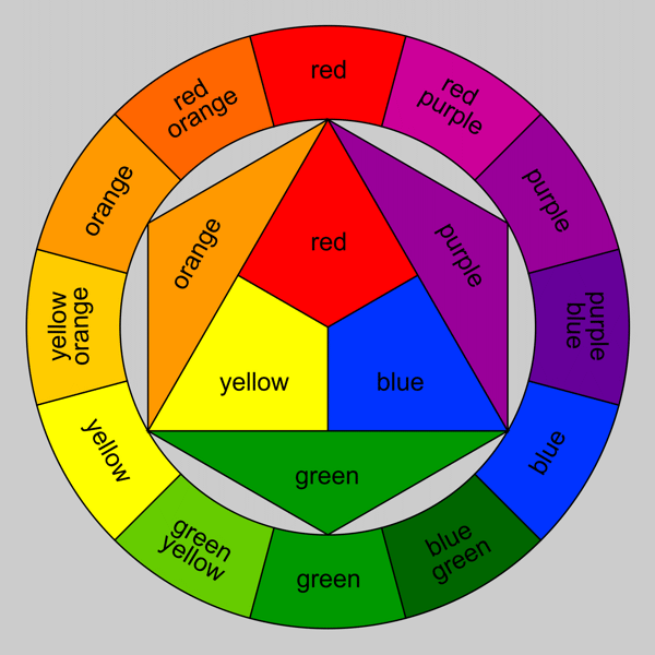
It's a Color Wheel. It's a quilt. It's a Color Wheel Quilt.
Value
Value and Color go hand in hand. Value describes the lightness or darkness of a color and how it interacts in a piece. This is where you find shades, tints and tones.

Value. It has it.
Value creates highlights and shadow, and in so doing creates visual depth in a quilt.

Through the use of value, this quilt has depth and it give the visual impression of 3 dimensions.
Line
Line is a continuous mark made by a single moving point, a connection between two points, which can follow any path between the two. Line is what provides the delineation between two spaces, either with an intentional line (like a coloring book outline) or an implied line (say, the line created between two differently colored spaces), and what gives shapes their definition.

This is a great example of the use of line and its many variations and applications
In quilts, line is created by the seams, by color placement, by pattern or by block arrangement.

These blocks and applique give the impressioon of a continuous, convoluted line.
Shape
Shape defines the visual delineations of an object, and is determined by line or color. A shape is always two dimensional, and can either be geometric (with straight sides) or organic (with curved or irregular sides). To the eye, the outline of a basketball is a circle, the outline of a door is a rectangle, and the outline of a leaf is a variable, organic shape that is characterized only by that species of plant. Quilters use shape when deciding how they want their quilt to look - do they want their quilt square, rectangular, octagonal, square with rounded corners, circular, rectangular with scalloped edges? Shape dictates form.


An octagonal quilt
Form
This is the physical, three dimensional shape of the piece, or the effect of three dimensions on a two dimensional surface. Where to the eye a basketball is a circle, to the hand it is a sphere, the door is a box-like rectangle, and the leaf is a wafer thing, irregular edged sheet of plant matter.

From a shape on paper to the form of the hands.
Form determines size and function, and for a quilt, it is a very important thing to consider - does it need to be large enough to fit a Cal King bed, or is it just meant to hang on the wall? How much loft do you want to your batting? Are there any three dimentional additions to your quilt, changing it's form - buttons, ribbons, trepunto, folding? Do you want certain blocks to jump out that the observer, appearing three dimensional? A tumbling Block quilt is a great example of visual form.

This Tumbling Block quilt makes it look, through the use of value and form, like you could kick those stacked blocks over and they'd all fall down.
Texture
Texture is the either visual or physical feeling of a space, and obviously is very important in quilting. Texture can be implied visually through the use of line, color and value, like we see in lanscape fabrics in which they are made to look like woodgrain, sand or pebbles. It is also literal, giving the eye a visual texture and the hand a physical one.
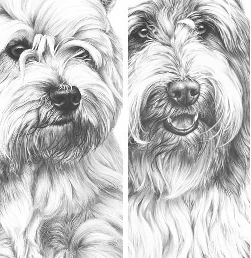
The visual texture of fur here is incredible. It looks like you could touch the picture and feel that dog's fur.
This is most common when quilters mix fibers, like putting flannel and cotton, or velvet and silk together. They are viually AND physically different textures.

The use of various fibers in a quilt gives it both physical and visual texture.
Principles of Art
The Principles of Art (PoA) are the results of organizing the EoA into certain and intentional arrangements. This are also criteria by which an art piece is judged. There are nine PoA.
Balance
Balance is achieved base don the way the EoA are arranged in an art piece. By arranging Elements in a particular fashion, the artist can create feelings of heaviness or lightness, darkness or brightness.
This is somewhat asymmetrical balance.
In a quilt, this is what we consider when we want to adjust symmetry.
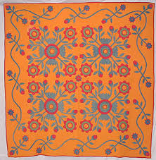
This quilt is balanced because of it's just about perfect symmetry.
Contrast
Contrast is the difference between two portions of a work that creates a pop, tension and interest. It helps a work to flow dynamically. With contrast, subtlety is definitely not the name of the game.

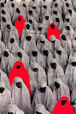
There is no higher contrast than geometric black and white.
For quilts, this is achieved mainly by color placement, value assignment and variation in block style and size compared to those it's paired with.
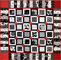
This quilt has high contrast color as well as block size.
Proportion
Proportion mainly deals with the size of a component as compared to the sizes of the surrounding components. it goes hand in hand with Emphasis - larger items are emphasized more than something smaller by comparison. A good example of conscious use of proportion is with charactatures - they are drawn with a person's most identifying features (small eyes, a wide mouth, chubby cheeks, a prominent chin, a delicate nose, for example) being shown the most out of proportion with what one would expect from a portrait, either drawn comically small or absurdly large.

Leonardo diCaprio, your forehead is disproportionately large compared to your face.
With quilts, this mainly is achieved with altering the focus portions of a block - stretching them in one direction or another, making one block very large while others are small, etc. For quilts, this often gives a more whimsical or fantastical feel to a quilt.

The star blocks are out of the expected proportiuon, giving this quilt a more whimsical feel.
MovementThis is a piece's "flow," how the eye moves through the piece through a guided means using the EoA. More dynamic movement in a piece gives the viewer an impression of excitement, volatility and energy. Static movement gives a sense of seriousness, calm or quiet.

This wave looks like it could crash any second. You can almost hear the sound of it. The use of movement here is highly effective!
There are entire quilt techniques built around this concept. Bargello quilts give a sense of waving movement, like a flag. Watercolor quilts have a cascading movement. It can be achieved in so many ways that a quilter must carefully (whether she/he actively thinks it or not) consider fabric choice so as not to create vibrations of a busy print in an otherwise calm piece, for example.

Here the movement is created through the quilting rather than the piecing.
Pattern/Rhythm
This PoA can also be called "rhythm" but most often you'll see it defined as Pattern. This is the repetition of EoA with the intention of creating consistent intervals of EoA, and this goes hand in hand with Movement. Pattern and Rhythm guides the eye as the artist chooses, and if used in a particular way, can give the
impression of Movement.
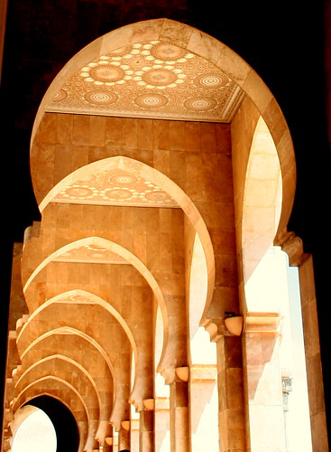
Pattern in the ceiling,rhythm in the repeated arches.
Pattern is prevalent in quilting, from the prints on a fabric and the placement of colors in a block, to the repetition of the blocks through a quilt.

There is distinct pattern in the blocks and in the fabric. "Yo dawg, I heard you like pattern..."
Emphasis
This is the focus of the piece, achieved by arranging the EoA and other PoA in such a way that this portion is the first thing you eye goes to upon looking at the work. This is the thing you want viewers to pay the most attention to.

One of these things is not like the other...emphasis!
In a quilt, this would be your focus fabric, your most dominant block or color.

Hey, guess where the emphasis is? Oh, and this is a good use of space, too.
Unity/Harmony
Quite simply, Unity and Harmony describe the visual completeness of a piece. If you look at something and have to ask "...is that finished? It feels like something's missing," then that piece lacks unity. Harmony comes in to play when unity is achieved using similar PoA and EoA, for exmaple using line, form, rhythm and movement to create the desired effect as opposed to focusing on color, value and emphasis.

Unity. It has it.
Quilters have to think about the whole piece, from the fabric type and color choice to blocks to accents to borders to attain untiy in their quilt, just as a painter must consider color as well as paint texture.

I think they got all their bases covered here, don't you?
Variety
Variety is exactly what it sounds like - it is the changes we see in an art piece that are different from one another. It can be achieved through use of color, emphasis, size, really any of the EoA or PoA.

Value. Depth. Contrast. Color. Emphasis. Yes, this painting has variety all right.
For quilters this means using different types of blocks, different size blocks, more than one color, different fabric types - the possibilities are endless. Having a lot of variety creates a lot of visual interest because the eye has more to process than pieces with less variety in them. That's not to say that little variety is a negative thing; many contemorpary quilts and minimalist pieces create their impact by having a single focus and little variety otherwise.

Where it lacks variety in block style, it achieves it through block size. This quilt is simple, yet it is very visually engaging
***
If you've made it this far and you're still with me, you can plainly see that all of the Elements and Principles of Art play a huge role in quilting. On the surface to many ears it seems a bold claim to declare that quilting is as legitmate an art form as sculpture and painting, but the truth of the matter is that every quilt a person makes, whether it is the result from conscious planning on the part of the quilter or not, is guided by and contains all of the Elements and Principles of Art. The next time you find yourself in a quilt shop or at a quilt show, consider these factors and you will see time and time again these criteria being met in countless different ways. On a deeper, more philosophical level, one must consider more than the observable checklist of criteria in determines what ought to be considered art and what shouldn't. So where does "folk art" fit in on that spectrum? It seems to ride the borderline between being art and being a craft, but where does that distinction lie, and why is there such a hugely different connotation between the two? That is up to you to decide for yourself.
In my opinion, I truely consider quilting an art as it meets the observable criteria, there is purpose and meaning behind it, it requires artistic thought, and it requires a skill set that isn't innate - while anyone can do it, it still must be learned and practiced. To me, quilting is relgated to the oft-sniffed at concept of Folk Art ("it's not real art, but it is art in a way") because its roots aren't found in wealth, prestige and lofty ideals the way the formal arts claim their roots in the great ancient civilizations with works made for royalty and religion. Quilting has its roots in the ground, among the dust and the dirt, with pioneers, working class, and the elite alike. The skills required for quilting have more practical origins than do other arts - sewing has been a necessity since humankind figured out that clothing is a real asset to possess - and as such the attitude of "well, it's just sewing, anyone can sew" has both helped and hindered quilting as an art. The formal art community may not see the artistic merit of quilting on those grounds alone, not to mention the fact that it is a functional piece of art and not merely a decorative art. Again, the lines are blurred and you can find many an article and argument for both sides of the Art community versus Quilting community, is it art, is it not arguement. This is simply my own opinion based on my observations and academic research work (quilting was my Anthropological thesis after all) - I encourage you to look out there and make your own decision as to whether quilting is, is not or is both.
I encourage and welcome your discussion about quilting as art in the comments section below. Please tell me what you think and let's have a debate of our own!
Sources and Additional Information
Elements and Principles of Art Slideshow
Good ol' Fashioned Wikipedia (taken with a grain of salt, of course)
International Quilt Study Center & Museum
The Elements of Art
The Elements of Art (EoA) describe the concrete visual and physical attributes of an art piece. They are the building blocks of Art, the basic factors the artist manipulates to create the piece as well as define the Principles of Art, which I will discuss later. An art piece is judged in part based on the EoA. There are 7 EoA.
Space
Space is exactly what it sounds like - it is the area earmarked for a purpose. It includes foreground, middleground and background. In quilting it is mainly observed as the areas inbetween the focus components of a pattern or in the pattern of the fabric. This is where your eye comes to rest from the other colors and patterns. Positive space constitues the focus pieces, and negative spaces contain the "nothingness," the spaces aside from any focus component. Space is the most basic and essential EoA.
Left: The area around the Ram is the Space in the picture. Note the spaces around the horns and body and between the legs. Right: The white is the focus, and therefore the positive space. The black is the background and non-focus space, and therefore the negative space.
In quilting, space is used so many ways it is really too vague to describe here, so I offer you this instead:
It has space and shows Space! :D
Color
This is pretty self explanitory for any art form. In terms of the EoA, this describes every aspect of color - the color choice, it's placement, it's intensity (barring tint, shade and tone which fall under the EoA "Value").
Remember this guy?
In quilting, like space, color is used in so many ways that it's near impossible to concretely describe its use here. So I offer you this instead:
It's a Color Wheel. It's a quilt. It's a Color Wheel Quilt.
Value
Value and Color go hand in hand. Value describes the lightness or darkness of a color and how it interacts in a piece. This is where you find shades, tints and tones.
Value. It has it.
Value creates highlights and shadow, and in so doing creates visual depth in a quilt.

Through the use of value, this quilt has depth and it give the visual impression of 3 dimensions.
Line
Line is a continuous mark made by a single moving point, a connection between two points, which can follow any path between the two. Line is what provides the delineation between two spaces, either with an intentional line (like a coloring book outline) or an implied line (say, the line created between two differently colored spaces), and what gives shapes their definition.
This is a great example of the use of line and its many variations and applications
In quilts, line is created by the seams, by color placement, by pattern or by block arrangement.
These blocks and applique give the impressioon of a continuous, convoluted line.
Shape
Shape defines the visual delineations of an object, and is determined by line or color. A shape is always two dimensional, and can either be geometric (with straight sides) or organic (with curved or irregular sides). To the eye, the outline of a basketball is a circle, the outline of a door is a rectangle, and the outline of a leaf is a variable, organic shape that is characterized only by that species of plant. Quilters use shape when deciding how they want their quilt to look - do they want their quilt square, rectangular, octagonal, square with rounded corners, circular, rectangular with scalloped edges? Shape dictates form.
An octagonal quilt
Form
This is the physical, three dimensional shape of the piece, or the effect of three dimensions on a two dimensional surface. Where to the eye a basketball is a circle, to the hand it is a sphere, the door is a box-like rectangle, and the leaf is a wafer thing, irregular edged sheet of plant matter.
From a shape on paper to the form of the hands.
Form determines size and function, and for a quilt, it is a very important thing to consider - does it need to be large enough to fit a Cal King bed, or is it just meant to hang on the wall? How much loft do you want to your batting? Are there any three dimentional additions to your quilt, changing it's form - buttons, ribbons, trepunto, folding? Do you want certain blocks to jump out that the observer, appearing three dimensional? A tumbling Block quilt is a great example of visual form.
This Tumbling Block quilt makes it look, through the use of value and form, like you could kick those stacked blocks over and they'd all fall down.
Texture
Texture is the either visual or physical feeling of a space, and obviously is very important in quilting. Texture can be implied visually through the use of line, color and value, like we see in lanscape fabrics in which they are made to look like woodgrain, sand or pebbles. It is also literal, giving the eye a visual texture and the hand a physical one.
The visual texture of fur here is incredible. It looks like you could touch the picture and feel that dog's fur.
This is most common when quilters mix fibers, like putting flannel and cotton, or velvet and silk together. They are viually AND physically different textures.
The use of various fibers in a quilt gives it both physical and visual texture.
Principles of Art
The Principles of Art (PoA) are the results of organizing the EoA into certain and intentional arrangements. This are also criteria by which an art piece is judged. There are nine PoA.
Balance
Balance is achieved base don the way the EoA are arranged in an art piece. By arranging Elements in a particular fashion, the artist can create feelings of heaviness or lightness, darkness or brightness.
This is somewhat asymmetrical balance.
In a quilt, this is what we consider when we want to adjust symmetry.
This quilt is balanced because of it's just about perfect symmetry.
Contrast
Contrast is the difference between two portions of a work that creates a pop, tension and interest. It helps a work to flow dynamically. With contrast, subtlety is definitely not the name of the game.
There is no higher contrast than geometric black and white.
For quilts, this is achieved mainly by color placement, value assignment and variation in block style and size compared to those it's paired with.
This quilt has high contrast color as well as block size.
Proportion
Proportion mainly deals with the size of a component as compared to the sizes of the surrounding components. it goes hand in hand with Emphasis - larger items are emphasized more than something smaller by comparison. A good example of conscious use of proportion is with charactatures - they are drawn with a person's most identifying features (small eyes, a wide mouth, chubby cheeks, a prominent chin, a delicate nose, for example) being shown the most out of proportion with what one would expect from a portrait, either drawn comically small or absurdly large.
Leonardo diCaprio, your forehead is disproportionately large compared to your face.
With quilts, this mainly is achieved with altering the focus portions of a block - stretching them in one direction or another, making one block very large while others are small, etc. For quilts, this often gives a more whimsical or fantastical feel to a quilt.
The star blocks are out of the expected proportiuon, giving this quilt a more whimsical feel.
MovementThis is a piece's "flow," how the eye moves through the piece through a guided means using the EoA. More dynamic movement in a piece gives the viewer an impression of excitement, volatility and energy. Static movement gives a sense of seriousness, calm or quiet.
This wave looks like it could crash any second. You can almost hear the sound of it. The use of movement here is highly effective!
There are entire quilt techniques built around this concept. Bargello quilts give a sense of waving movement, like a flag. Watercolor quilts have a cascading movement. It can be achieved in so many ways that a quilter must carefully (whether she/he actively thinks it or not) consider fabric choice so as not to create vibrations of a busy print in an otherwise calm piece, for example.
Here the movement is created through the quilting rather than the piecing.
Pattern/Rhythm
This PoA can also be called "rhythm" but most often you'll see it defined as Pattern. This is the repetition of EoA with the intention of creating consistent intervals of EoA, and this goes hand in hand with Movement. Pattern and Rhythm guides the eye as the artist chooses, and if used in a particular way, can give the
impression of Movement.
Pattern in the ceiling,rhythm in the repeated arches.
Pattern is prevalent in quilting, from the prints on a fabric and the placement of colors in a block, to the repetition of the blocks through a quilt.
There is distinct pattern in the blocks and in the fabric. "Yo dawg, I heard you like pattern..."
Emphasis
This is the focus of the piece, achieved by arranging the EoA and other PoA in such a way that this portion is the first thing you eye goes to upon looking at the work. This is the thing you want viewers to pay the most attention to.
One of these things is not like the other...emphasis!
In a quilt, this would be your focus fabric, your most dominant block or color.
Hey, guess where the emphasis is? Oh, and this is a good use of space, too.
Unity/Harmony
Quite simply, Unity and Harmony describe the visual completeness of a piece. If you look at something and have to ask "...is that finished? It feels like something's missing," then that piece lacks unity. Harmony comes in to play when unity is achieved using similar PoA and EoA, for exmaple using line, form, rhythm and movement to create the desired effect as opposed to focusing on color, value and emphasis.
Unity. It has it.
Quilters have to think about the whole piece, from the fabric type and color choice to blocks to accents to borders to attain untiy in their quilt, just as a painter must consider color as well as paint texture.
I think they got all their bases covered here, don't you?
Variety
Variety is exactly what it sounds like - it is the changes we see in an art piece that are different from one another. It can be achieved through use of color, emphasis, size, really any of the EoA or PoA.
Value. Depth. Contrast. Color. Emphasis. Yes, this painting has variety all right.
For quilters this means using different types of blocks, different size blocks, more than one color, different fabric types - the possibilities are endless. Having a lot of variety creates a lot of visual interest because the eye has more to process than pieces with less variety in them. That's not to say that little variety is a negative thing; many contemorpary quilts and minimalist pieces create their impact by having a single focus and little variety otherwise.
Where it lacks variety in block style, it achieves it through block size. This quilt is simple, yet it is very visually engaging
***
If you've made it this far and you're still with me, you can plainly see that all of the Elements and Principles of Art play a huge role in quilting. On the surface to many ears it seems a bold claim to declare that quilting is as legitmate an art form as sculpture and painting, but the truth of the matter is that every quilt a person makes, whether it is the result from conscious planning on the part of the quilter or not, is guided by and contains all of the Elements and Principles of Art. The next time you find yourself in a quilt shop or at a quilt show, consider these factors and you will see time and time again these criteria being met in countless different ways. On a deeper, more philosophical level, one must consider more than the observable checklist of criteria in determines what ought to be considered art and what shouldn't. So where does "folk art" fit in on that spectrum? It seems to ride the borderline between being art and being a craft, but where does that distinction lie, and why is there such a hugely different connotation between the two? That is up to you to decide for yourself.
In my opinion, I truely consider quilting an art as it meets the observable criteria, there is purpose and meaning behind it, it requires artistic thought, and it requires a skill set that isn't innate - while anyone can do it, it still must be learned and practiced. To me, quilting is relgated to the oft-sniffed at concept of Folk Art ("it's not real art, but it is art in a way") because its roots aren't found in wealth, prestige and lofty ideals the way the formal arts claim their roots in the great ancient civilizations with works made for royalty and religion. Quilting has its roots in the ground, among the dust and the dirt, with pioneers, working class, and the elite alike. The skills required for quilting have more practical origins than do other arts - sewing has been a necessity since humankind figured out that clothing is a real asset to possess - and as such the attitude of "well, it's just sewing, anyone can sew" has both helped and hindered quilting as an art. The formal art community may not see the artistic merit of quilting on those grounds alone, not to mention the fact that it is a functional piece of art and not merely a decorative art. Again, the lines are blurred and you can find many an article and argument for both sides of the Art community versus Quilting community, is it art, is it not arguement. This is simply my own opinion based on my observations and academic research work (quilting was my Anthropological thesis after all) - I encourage you to look out there and make your own decision as to whether quilting is, is not or is both.
I encourage and welcome your discussion about quilting as art in the comments section below. Please tell me what you think and let's have a debate of our own!
Sources and Additional Information
Elements and Principles of Art Slideshow
Good ol' Fashioned Wikipedia (taken with a grain of salt, of course)
International Quilt Study Center & Museum
Wednesday, September 28, 2011
Cabins in the Stars
Here is one of those current projects I mentioned a couple posts ago. This one is called Cabins in the Stars by Rita Fishel in her book Everyday Quilts. I loved it, and it's outside of the box for me. You know how I feel about piecing...I usually stick with applique when I can help it. But this one, basic though it is, really called to me and I had just the fabrics in mind. Consider of course the fluorescent lighting in my house and the camera phone, but the colors are much more intense than shown. The pink really glows next to the purple and copper metallic.


As you can see, I did mix batiks and regular quilting cottons together in this quilt. Usually I opt for one or the other, but in this case the subtle prints in the browns and the Fairy frost really offset the batiks well. As far as sewability, they sew together just fine! I have to say, I LOVE the way batiks sew. They press nice and flat, they don't ravel as much...Beauteous.
Since I'm on Mom-mandated day off from work today, I'm going to try and get this done. Oh, and I'm teaching my roomate how to sew too! I'm excited for her to start :D Mo' quilting buddies, mo' betta'!

Rita Fishel's book. It's a really good one, lots of beautiful, versatile patterns.

This is the pattern I'm doing. I know it's hard to see but it's basically Log Cabin blocks and Variable Stars. It goes to show how color placement and block arrangement can make a simple pattern spectacular!

This is that pink/purple (both batiks) combination in the log cabin. Where you see the orchid purple in the pink is actually a really electric pink in an otherwise magenta and rust batik. It really is a stunning piece in person, and I fell in love with it as soon as I saw that shock of glowing pink in there.

Again, it's hard to tell but the center fabric (a batik) isn't that dull. It has the purple, magenta and copper in there so it really pulls everything together. The background is a deep chocolate brown (not a batik) and that copper (Also not a batik, it's Fairy Frost in "Coin" by Michael Miller) really makes the log cabin and center fabric just pop.
As you can see, I did mix batiks and regular quilting cottons together in this quilt. Usually I opt for one or the other, but in this case the subtle prints in the browns and the Fairy frost really offset the batiks well. As far as sewability, they sew together just fine! I have to say, I LOVE the way batiks sew. They press nice and flat, they don't ravel as much...Beauteous.
Since I'm on Mom-mandated day off from work today, I'm going to try and get this done. Oh, and I'm teaching my roomate how to sew too! I'm excited for her to start :D Mo' quilting buddies, mo' betta'!
Tuesday, September 27, 2011
This is the best Color Theory site I have ever seen.
Remember way back when...a couple weeks ago...I posted an article going through the ins and outs of Color Theory for Quilters? Well this site, Color Scheme Designer 3 is the best color scheme generator I have seen yet. It uses the color wheel, so you click on the color you want and you have the ability to choose the see the color schemes in your color of choice - Analogous, Complementary, Triads, Tetrads, Analogic and Accented Analogic. I only explained Analogous and Complementary in my article, but if you look at the icon you'll quickly figure out what the others are. So say you have a focus fabric that is dominantly one color family; pop those dominant colors in thier color wheel and see what other "pop" colors you have at your disposal, or which will blend best before you spend the hours agonizing over choocing go withs. I know I'll be using this site a lot in the future. Oh, and did I mention it has specific color wheels designed for color blindness? So for my color blind readers and all the color blind quilters out there (I don't mean that facetiously; there really are quilters who suffer from color blindness and their quilts turn out wonderfully) who are feeling insecure about color choice, this is defintely worth a look. Choose your type of color blindness from the menu and it will take you to a color wheel that reflects what you see. How cool is that?!
Seriously. Give the Color Scheme Designer 3 a try! You won't be disappointed.
Seriously. Give the Color Scheme Designer 3 a try! You won't be disappointed.
Tippy Tuesday
Boy howdy. September hasn't been kind to us. Of course with all the stuff going on with mom and our local hospital ardently trying to kill her (not kidding), I'm sick for the second time this month. Hey, September, knock it off! Anyway, my fall table runner is back from the quilter and ready to be bound. I have that leopard print quilt yet to bind, and I'm slowly but steadily piecing all the 312 triangles together for my pumpkin quilt (pictures to follow) and my log cabin/star quilt is looking pretty fancy (also pictures to follow). So even being sick there's no rest for the stitchy.
On to the Tips! Oh, and by the way, if you send in your own tip to thecottonpatch@msn.com and it gets posted in the Tips section in the weekly newsletter, you get a prize! Even if you think everyone knows it, submit it anyway - free stuff is a wonderful thing! Unfortunately this offer applies to local ladies only - we don't do prizes by mail, but we still welcome your tips!
* The cardboard trays that soda packs come in are great for holding projects, because despite their size, they take up very little room when stacked up, and they stack very nicely. Label them as you see fit and there you have it - an inexpensive storage method, plus you're reusing something you might otherwise just throw away/recycle!
* Put an empty tissue box next to your machine to toss threads, paper piecing bits, fusible applique waste and fabric snippings into. It's reusable and its contents are easier to throw away.
* If you're having a hard time gripping the needle as you're hand stitching, try using a finger cot on the fingers you're using to pull the needle through. That little bit of extra grip works wonders. Plus, for this purpose they aren't only good for one use and a $2 pack of finger cots will last you a long, long time.
* If your cutting matting is looking pretty haggard with years of cutting grooves on it, fliip it over and use the underside. If your mat is that translucent plastic, then the lines are still visible and you can trace them in permanent marker on the backside, of course being very careful to trace accurately. If your mat isn't the transluscent plastic, well, measure out lines the old fashioned way, or just use your ruler to get your measurements.
* If you're having a hard time maintaining a good 1/4" as you sew, use a piece of blue painter's tape and tape it to your machine below your pressure foot, in line with the 1/4" marker on the feed dog plate. This will enable you to see that 1/4" farther down and give you a larger guideline to go by.
* This one is one of my tried and trues, and I'm not sure if I've posted it before but what the hey, here it is (again): Those gallon sized ziplock bags (with the movable sipper thing on top) are a godsend. I have a tendency to leave and lose blocks and this keeps them all contained and protects the raw edges from ravelling and anything from stretching or wrinkling. The bags are reusable project to project and a box will last a long time.
* Before each project where you need to be using a particular bobbin thread, fill several bobbins with that color to save you time later. When you'r ein a groove and run out of bobbin thread, it's a groove crusher to spend the additional time away from working to wind another bobbin.
* Need a circle template? Use a sample CD that AOL and other companies send around in junk mail. They're durable and just about the perfect size for most projects.
* For posterity, sew your quilt label onto your backing before quilting your quilt. It makes it more stable and more difficult to remove later on. That way everyone in years to come knows who made the quilt!
* Use muslin or fusible interfacing to stabilize t-shirt blocks before you sew them - it'll prevent the knit from stretching funny when compared to the flannel or cotton you use for sashing.
Friday, September 23, 2011
Top 5 Quilting Notions and Tools I Can't Live Without
1. Omnigrid 4" Needlecraft Scissors

I LOVE these scissors. Seriously. I carry them with me always (well, except on planes) because they are useful for so much. While I don't care for their rulers, one of the great things about Omnigrid Scissors is that they stay sharp for a very long time and these little guys are no exception; we use Omnigrid scissors at the shop and after 7 years they have not dulled. These are great for cutting out applique, because the tip is so sharp it cleanly gets into any of the teeny corners your applique may have. They're perfect for keeping by your machine for snipping threads, because they stay out of the way. But most of all, these have replaced my seam ripper and my seam snip scissors. The tip of these scissors is so small and SO sharp it gets in under the stitches of a seam easier than a plain ol' seam ripper, in my opinion. We do carry these at The Cotton Patch, so if you want to give 'em a try, come on in!
2. Atlas Gardening Gloves

Here's a secret - the best quilting gloves I have ever had were a pair of my Mom's gardening gloves. She turned me on to this, too! These are Atlas brand gardening gloves, and the palm surface of the glove is rubberized from the tips of your fingers to the heel of your hand. This gives you a greater surface gripping area while you're quilting your quilt, therefore you have less slippage and greater control than you do with quilting gloves that have finger grips only. The back of them are cloth so they breath very nicely - no sweaty hands! Plus, you can get them very inexpensively (less than $5 at Fred Meyer here in Oregon, comparably priced at places like Lowes, Home Depot, Walmart, etc) and they last for a long time. They seriously facilitate the quilting process on a domestic machine.
3. Bamboo Stiletto
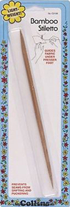
We have these at the shop. They're exactly what they sound like. It's a stiletto. It's made of bamboo. What I like so much about it is that it's double ended; there is a thicker side for more heavy duty tasks, and a thinner sharper side for normal stiletto duties. I like these better than the metal ones, because the metal ones have a tendency to dull over time and separate from their handles. Bamboo stilettos come in one whole piece, it's durable, keeps its point and it's a very sustainable and renewable resource. They are inexpensive so you get a lot of bang for your buck, because they are great for more than just guiding fabric through your feed dogs. I use it for applique, scrapbooking, working with polymer clay...it's great.
4. Emery Board
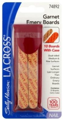
Yes. A regular, plain ol' emergy board. Dollar Store, Rite Aid, Target...they can be found everywhere, eveb gas station quickie marts. For one, I break nails all the flippin' time, even quilting, so I need 'em. But what I really use them for most is after ripping out a seam, it gets those stray threads out better than anything else I have tried. There is no way I'm going to pick those little things out by hand, so running an emery board over those threads (gently!) works like a dream and a $2 pack will literally last you years because the surface won't wear down quickly on snipped threads.
5. Applique Pressing Sheet

We have these at the shop. If you do fusible applique, this thing comes in handy like you wouldn't believe. You can build your appliques up and fuse them together before positioning them on your background. It helps ensure that you get your image put together correctly before it's fused to tha background and it's too late to fix it. It's transluscent so that helps you see your fabrics and lines as needed. It's also great for fusing Angelina Fibers, using to catch hot glue, or using any glue on because it'll peel or wash right off, no problems. They are reasonably priced and last for ages.
I LOVE these scissors. Seriously. I carry them with me always (well, except on planes) because they are useful for so much. While I don't care for their rulers, one of the great things about Omnigrid Scissors is that they stay sharp for a very long time and these little guys are no exception; we use Omnigrid scissors at the shop and after 7 years they have not dulled. These are great for cutting out applique, because the tip is so sharp it cleanly gets into any of the teeny corners your applique may have. They're perfect for keeping by your machine for snipping threads, because they stay out of the way. But most of all, these have replaced my seam ripper and my seam snip scissors. The tip of these scissors is so small and SO sharp it gets in under the stitches of a seam easier than a plain ol' seam ripper, in my opinion. We do carry these at The Cotton Patch, so if you want to give 'em a try, come on in!
2. Atlas Gardening Gloves
Here's a secret - the best quilting gloves I have ever had were a pair of my Mom's gardening gloves. She turned me on to this, too! These are Atlas brand gardening gloves, and the palm surface of the glove is rubberized from the tips of your fingers to the heel of your hand. This gives you a greater surface gripping area while you're quilting your quilt, therefore you have less slippage and greater control than you do with quilting gloves that have finger grips only. The back of them are cloth so they breath very nicely - no sweaty hands! Plus, you can get them very inexpensively (less than $5 at Fred Meyer here in Oregon, comparably priced at places like Lowes, Home Depot, Walmart, etc) and they last for a long time. They seriously facilitate the quilting process on a domestic machine.
3. Bamboo Stiletto
We have these at the shop. They're exactly what they sound like. It's a stiletto. It's made of bamboo. What I like so much about it is that it's double ended; there is a thicker side for more heavy duty tasks, and a thinner sharper side for normal stiletto duties. I like these better than the metal ones, because the metal ones have a tendency to dull over time and separate from their handles. Bamboo stilettos come in one whole piece, it's durable, keeps its point and it's a very sustainable and renewable resource. They are inexpensive so you get a lot of bang for your buck, because they are great for more than just guiding fabric through your feed dogs. I use it for applique, scrapbooking, working with polymer clay...it's great.
4. Emery Board
Yes. A regular, plain ol' emergy board. Dollar Store, Rite Aid, Target...they can be found everywhere, eveb gas station quickie marts. For one, I break nails all the flippin' time, even quilting, so I need 'em. But what I really use them for most is after ripping out a seam, it gets those stray threads out better than anything else I have tried. There is no way I'm going to pick those little things out by hand, so running an emery board over those threads (gently!) works like a dream and a $2 pack will literally last you years because the surface won't wear down quickly on snipped threads.
5. Applique Pressing Sheet
We have these at the shop. If you do fusible applique, this thing comes in handy like you wouldn't believe. You can build your appliques up and fuse them together before positioning them on your background. It helps ensure that you get your image put together correctly before it's fused to tha background and it's too late to fix it. It's transluscent so that helps you see your fabrics and lines as needed. It's also great for fusing Angelina Fibers, using to catch hot glue, or using any glue on because it'll peel or wash right off, no problems. They are reasonably priced and last for ages.
Quilts for a Cause
Okay, I'll admit, this perhaps isn't for all senses of humor. But I think this is a good cause and hilarious medium for fundraising.
The short and sweet story is that Megan Smith's brother has brain cancer, and has since early 2010. As anyone can imagine, or as anyone who has had cancer or a relative with cancer, it is a long treatment process that costs big, big money. Being the funny lady and caring sister she is, she pulled a Calendar Girls move (only with men) and designed a 2012 calendar to help raise money for her brother's treatment with her readers (and reader's husbands) as models.
Men. Quilts. Burritos?! Read her story and see the calendar! It's great for a giggle and it's for a great cause.
Thursday, September 22, 2011
Thursday, It's Technical: Quilt Batting Basics
Batting (or padding/wadding as it is also known in other regions of the world) is one of those utilitarian items that just about all quilts have but seldom is any importance placed on it to - after all, it's just the "fluffy stuff" that makes your quilt poufy and warm, and no one sees it once the quilt is finished, so why pay it much mind? Okay, so you're half right. Batting is nowhere near as important as your fabric choice, or how you choose to quilt your quilt. But batting does dictate to a certain degree how your quilting turns out, and it determines the look your quilt will have three-dimensionally. Not all battings are created equal for your purpose! This time, I'm going to discuss from the group up what batting is exactly, what it's made of, the types and what kind of batting is (in general, there is always variation in opinion about it) better suited for which kind of project.
Batting Terms
Batting is the middle, fibrous layer of your quilt that no one sees. It can vary in fiber content and in weight, but it is what gives your quilt its warmth and thickness.
Batt is another word you'll hear tossed around, more often colloquially than not. It is just a synonym for batting.
Bonded Battings are held together by a glue-like material that has been fused to the fibers to keep everything together.
Needle Punched Battings are held together by the scrim, and are felted toegther using hundreds of tiny needles. There is no glue-like bonding agent.
Scrim is a very loosely woven netting used in needle punched battings. It can either be synthetic or natural in composition, and helps to keep the batting more stable and durable than a fusing agent alone.
Natural Batting is comprised of one or more natural fibers like cotton, wool, bamboo, or silk
Synthetic Batting is made from "unnatural" (meaning, not occuring in nature) fibers. Polyester and Poly-Blends are the most common in this category
Drape describes the feel and how your quilt will lay after it is finished. Your batting choice and how much quilting you decide to do determines whether your quilt has a stiff or soft drape. Thicker batting and more quilting equates a stiffer drape; thinner batting and less quilting constitues and softer drape.
Loft is how thick or poufy your batting is. High loft is thicker, low loft is thinner. Many battings come in various loft choices, but some only have one loft style.
Bearding is the batting fibers coming through the front and back of your quilt, and is definitely not a good thing. It occurs when a batting is poorly constructed and there isn't much you can do about it once it happens other than deal with it or rip our your quilting and replace the batting with something of a better quality.
Batting Types and Their Attributes
Cotton
Cotton is used most commonly out of the natural fibers. It is generally a low loft batting that is usually needle punched, but bonded can be found as well. White it is low loft, it is a pretty dense batting so at a low loft you'll stay warmer than you'd expect. It breathes well, meaning you'll stay warm but you won't overheat, and it does wick away moisture. That being said, cotton can mildew and retain smells if not taken care of properly. It shrinks on the initial wash, so after washing it will give quilts a more aged and used look (it wringles around the quilting stitch). As it is used though, it gets softer and softer, so it will drape very nicely over the bed and therefore over you. It can handle heavy quilting, so it is usually the batting of choice for show quilts, because it'll show off that wonderful, intricate quilting. With cotton, there is the option to find batting made with cotton free of pesticides and petroleum based fertilizers ("organic"). If the whole "organic" craze is important to you, then cotton is a good choice because you have that option. In terms of cost, it is middle of the road - not the spendiest but not the most inexpensive either.
Cotton-Poly
Cotton-Poly is a blend of Cotton and Polyester, so it isn't fully natural or synthetic and has the benefits of both; typically it is ~80% Cotton to ~20% Polyester. It is a higher loft than cotton, but a lower loft than Polyester. It is less prone to shrinkage like Polyester, but it is more breathable like cotton. It too can handle quite a bit of quilting, but not as well as cotton does. It has the warmth of Polyester without the weight of cotton, and it drapes very nicely. Generally speaking, it is roughly the same cost as 100% cotton batting.
Polyester
Polyester is the most popular and widely available synthetic batting on the market. It generally is a high loft batt, but several different lofts are available. It quilts nicely, especially for hand quilting, but it can't handle heavy machine quilting like natural fibers can. It's not a heavy batting, so that's a plus, but on the flip side of that coin, Polyester batts are subject to bearding because they aren't fused or needle punched as thoroughly. Unlike cotton, it is fully machine washable and dryer safe, won't retain mildewy smells and since it's synthetic it'll go back into shape after washing (no wrinkling around the quilting stitches). Polyester is definitely the way to go if you suffer from any kind of fiber allergies, because it is hypoallergenic by nature. However, it is a petroleum based material, so it isn't a renewable resource and it's not as environmentally friendly as other battings, if that is a concern of yours, then Polyester batting might not be for you. Of all the battings, Polyester is the least expensive option.
Wool
I have to say, wool is my batting of choice. It is generally a mid-loft, though thin wool batts are easily available. It natually regulates body temperature because it breathes and insulates at the same time, ensuring that you're not too hot or too cold. A neat thing about wool is that it can absorb 1/3 of its weight in water without feeling damp, so it'll still keep you warm even if it gets wet. Plus, wool quilts by both hand or machine very smoothly and really accentuates the stitches well. The downside to wool is that is not dryer safe because it can felt and get ruined by the heat of the dryer - air dry is the way to go. Moths also love wool batted quilts, just like they do wool sweaters, so it is important to keep an eye out for moth damage if you are storing the quilt. On the other hand, wool is naturally flame resistant so it is a good option for baby and children's quilts. However, if you're a fiber allergy sufferer, wool is not the fiber for you as it is the most common fiber that people are allergic to (it's the naturally occuring oil in the wool that is generally the culprit) and it has a tendency to beard if it's a lower quality wool batt. It is on the upper end of cost of the battings - less expensive than silk but more spendy than cotton or Polyester.
Alpaca
Alpaca batting is a type of wool batting. It is lightweight and very warm and breathable like wool, but it has a reduced allergy risk because it isn't oily the way sheep's wool is. It is usally blended with other natural fibers, and it is a needle-punched style batting. It does have the pitfall of felting and bunching in the dryer, and it is also susceptible to moth damage. It is the most expensive of the battings available simply because it is a specialty batting.
Bamboo
Bamboo is a truly wonderful, low loft batting. Bamboo is a fast growing plant, so it is a sustainable resource. It isn't as warm as wool, but it breathes like cotton and is perfect for summer quilts and throws. It is naturally hypoallergenic and antibacterial, so it's a good bet if you're an allergy sufferer. It doesn't beard because it a pretty flat, smooth batting. It is needle punched, so it doesn't have any bonding agents, but it makes it harder to hand quilt because it's fairly dense for being thinner. Bamboo tends to be on the expensive side of the spectrum, more comparable to wool, and it is more difficult to find than cotton is.
Silk
Silk batting is used less for quilts and more for quilted garments. It drapes the best out of all the battings, and it is incredibly warm for its thinness. It doesn't cling well to fabric, so machine quilting can be tricky as the fabric may slide over it.
Choosing the "Right" Batting for Your Quilt
The truth is there is no "right" choice, other than buying quality batting that won't clump or beard. Otherwise, it's all about the effect you want, the feel you want and what you enjoy working with. for myself, I stick with wool, cotton and bamboo....cotton and bamboo for tablerunners, wool for wall hangings and throws, and cotton for bedquilts. But here are a few guidelines to help you if you don't all ready have a batting in mind:
Hand Quilting - Wool, Polyester quilt the smoothest
Machine Quilting - Cotton, Wool, Alpaca, Cotton-Poly, Bamboo and Silk show off machine quilting well.
What size is your quilt? Low loft battings are perfect for tablerunners. Higherloft battings are great for wallhangings, because the thicker the batting, the straighter the piece will hang.
When will you use your quilt? Lower loft and breathable battings are best for summertime or warm climates - think cotton, bamboo, cotton-poly batts. Higher loft, less breathable battings are more suitable for cold weather quilts or cooler climates - think Polyester, wool or alpaca.
* Consider your budget and cost of batting. Plan to spend between $20-$40 on batting.
* Always follow the directions on your package of batting. It will let you know whether it can be used straight out of the package, how heavy or loose the quilting can be, the washing instructions and the fiber content.
Trial and error plays a big role in finding the right batting for you. I hope these tips and guidelines help you on your search!
Additional Information and Sources
Day Style Designs
Quilt University
Christine Mann's Batting Tips
As always, Google searches are great things!
Wednesday, September 21, 2011
Tippy Tuesday, only on Wednesday
Well, life has been crazy lately (and not in a fun "Barrel of Monkeys" way). Too much time has been spent in hospitals and at doctors appointments, and I've been triple-timing it at work so my time for anything more than work and sleep has been extremely limited. But we did finally get some good news - Mom doesn't have a heart problem. Her heart attack and related issues were not caused by a faulty ticker, but because of a thyroid disorder called Graves Disease. Don't worry, it's named after the doctor who discovered it in the 1920s, not after where you end up if you have it. Luckily it is easily treated and hopefully life will return back to normal for all of us soon. Needless to say, everyone in the family and at the shop are so very relieved it isn't anything more serious.
So, now to the tips. Since I haven't had a whole lot of time, I haven't gathered that many so I'm gathering while I'm writing. I haven't been able to test any of these out so they mayt or may not work for you but hey, it never hurts to give it a go on scrap or test fabrics/notions. Here we go!:
* Flannel works as a good batting subsitute if the quilt you're making is thick enough on its own (a Minkee quilt, for example) or if you want to keep your quilt really lightweight. Back in the day flannel was often used as "batting" because batting of a good quality wasn't always available where flannel was easier to obtain.
* Dishwasher utensil baskets make a great notion storage device - they are narrow and compact so they stay out of the way on your table, and they are easily hung up on the wall to be out of the way entirely. So if you're getting rid of a dishwasher, save that basket! Or, you can purchase one relatively inexpensively.
* If you're binding a quilt, and it's getting too warm to do while it's draped over you, move your ironing board to where you're seated and lower it to just above your lap. Drape the quilt over it and continue binding. The ironing board prevents the quilt from overheating you, and there is a nice draft between the quilt, board and you.
* While you're working on a project requiring several bobbins, stick a Q-Tip in the spool of thread, and then the bobbin through the Q-Tip. If you run out of thread, you will quickly know whch thread you used for that bobbin in case you forget.
* Keep inexpensive makeup brushes (eyeshadow and eyeliner brushes work best) as well as the fuzzy dental picks in your sewing kit. They are great for cleaning your machine when needed, and get into the nooks and crannies better than the brush your machine came with.
* If you have a cat or small dog, fabric scraps (apparently) make good chew toys. Tie a knot in it and let 'em at it. My chihuahuas can hardly wait until I start having scraps falling. I give them the big ones I know I won't use later, with the knot tied in it and believe it or not it gives them literally hours of entertainment gnawing on that thing. Sometimes they'll steal away the smaller ones and chew it to bits after it falls from my cutting board and I don't always catch it until it's been in their slobbery little mouths for a bit. They just shred them up, so it's not really a choking hazard, but it could be - stick with larger pieces.
* Clean your blades, both rotary and scissors, with rubbing alcohol to keep them gunk free and cutting smoothly.
* If you are thrying to thread a clear monofilament through a needle and not having much luck, there are two things you can do: first, thread it against a dark fabric since that makes the thread easier to see. or color the very tip of the thread with permanent marker so you can see it to thread it and then snip it off.
* Making cloth napkins and coasters are a great way to burn through your scraps/stash and they make nice gifts for people.
* Speaking of cloth napkins, if you have a theme decor in your dining room, buy cloth napkins that complement your color scheme or dishes and use them in a table runner. While the fabric quality may not be the same as quilting fabric, it's an inexpensive way to tie your room together. Plus, it's not a piece to be washed regularly so using the napkins is just fine. A heavier weight napkin tends to work a little better than the lightweight cotton ones.
* The edge of the selvedge tells you more than just the line and manufacturer. Those colored dots tell you how many different dye screens were used to make that whole fabric. As such, those are the individual colors that will match and blend nicely with that piece of fabric. So if you're stuck on the color choices with your go-withs, that selvedge is a great place to start looking!
Tuesday, September 20, 2011
Singing the Quilt Binding Blues
Nope, I haven't dropped off the face of the planet again. Last night we were back in the ER with Mom and I haven't been able to get to any of my blogging stuff. As I type I'm lounging on the not so comfy hospital room couch binding a quilt and keeping a sharp eye on the nurse giving Mom some heartrate control meds. I got my eyes on you, doc!
I hope everyone is having a low key week/day!
I hope everyone is having a low key week/day!
Friday, September 16, 2011
Fall Tablerunner
My fall allergies dang near have me down for the count, but at least this fall tablerunner won't make me sneeze...unlike the changing season...

 This little beauty goes off to the quilter tomorrow and then up as a sample at the shop. Now it's time for a heavy dose of Nightime Benadryl and a good long sleep.


Thursday: It's Technical - Copyright for Quilters
It seems strange that in an art with such a storied and sentimental history of collaboration, borrowing and sharing that copyright should even be in the discussion. Twenty years ago, it may not have been as much of an issue, but we hear it cropping up fairly often - in a time where designs are bought and sold at the speed of an internet connection and with quilters designing and sharing ideas faster than ever, copyright has become an important topic in the quilting world. In this sue-happy society we live in In the current intellectual and creative environment, it is important to be knowledgable about what can and can't be done in terms of designing, sharing, selling and buying quilts, quilt patterns, workshop instructions and books. To my own ear, it seems almost uppity that copyright even enters into the conversation when it comes to quilting, and for that reason it piqued my interest. It made me wonder who copyright laws differ for quilters than with other arts, and in what ways as quilters we should be mindful of copyright law and infringement. So here we have it, my second article, this time on Quilter's Copyright. As with any other article, I'm going to start explaining these guidelines on quilter's copyright from the ground up. As always, I'm not insulting anyone's intelligence, I'm just making sure it's as complete as possible.
DISCLAIMER: This article is in no way written with the intention of being, nor should it be misconstrued as, legal advice and I will not be held liable for or assume any responsibility for any consequences (negative or positive) that result from following the guidelines that follow. I strongly recommend that you supplement your research with your local copyright office and I encourage you to visit a copyright lawyer for your questions or issues with copyright and the associated laws rather than reading this or any other blog discussing copyright. It may not be 100% correct or complete. Do not pursue any percieved copyright infringements or attempt to obtain a copyright without consulting a lawyer who specializes in this area or your copyright office. Please know your rights. This is to serve as a set of guidelines only.
What Copyright is
According to the United States Copyright Office, "Copyright is a form of protection provided by the laws of the United States (title 17, U. S. Code) to the authors of 'original works of authorship,' including literary, dramatic, musical, artistic, and certain other intellectual works. This protection is available to both published and unpublished works." Certainly every country has their own copyright laws, but they are different only in very minor and technical ways, and so the general Copyright laws in your home country will more or less apply in any other with little variation.
It is important to note that copyright doesn't protect ideas as they exist in somoene's head or that have been verbally indicated. No one can sue for copyright infringement for simply thinking of something before someone else. Copyright protects "un/published ideas" meaning books, film, songs, poetry, artworks (to include quilts), patterns, magazines, articles, etc - the ideas become protected when they have been put down on paper (or in the case of music, written and then played) and it is through the media that the idea becomes property and protected by law. If something has been in progress and there is evidence to support the work, and it has not yet been formally published, it is still protected and this what is meant by "unpublished" works.
What are the benefits of a Copyright, either formal or implied?
A copyright holder reserves the exclusive right to make and distribute copies of their patterns privately or publicly, to make unlimited number of quilts of their pattern or derived from their pattern, to sell or lend patterns and projects made from their pattern and to publicly display their quilt as an original piece from an original pattern. A formal copyright also enables the holder to more effectively pursue legal course if their pattern is reproduced, stolen or a piece made from their design that isn't attributed to them, should they choose to do so.
Securing a Copyright
Accoring to the United States Copyright Office, once a work has been created, it is protected under copyright law and it is not required to seek a formal registration with the Copyright Office. The date of creation is understood to be the date of the first copy or recording of the work. Also, it is no longer required to put a notice of copyright on the work (you know, ©) as of 3/1/1989 since copyright is to be understood at point of creation. However it, is beneficial to always put the symbol on there because it lets people know that your design is copyrighted as of a certain year. You may find additional information on the ins and outs of US Copyright law and the process of securing a copyright in the United States by clicking on the link above. Go to page 7 for information on securing a copyright here - for your country, check your government's website for more information.
Guidelines for Quilter's Copyright
First off, let's define a couple terms that are more pertinent to the quilting world:
Copyright Infringement is "...when a copyrighted work is reproduced, distributed, performed, publicly displayed, or made into a derivative work without the permission of the copyright owner" (US Copyright Office - click for more copyright definitions).
Open/Public Domain is a work that is no longer protected by copyright. A copyright of an authored, published pattern or book, as of 2005, lasts the lifetime of the author plus 70 years. If the pattern/book is anonymous, then it lasts either 95 years after the first publishing, or 120 years after it's first creation whichever is earlier. A pattern or book published before 1928, due to changes in the law, is now public domain and may be sold copied or shared freely by anyone. (David Allen Hall, Ph.D., Registered Patent Attorney via Quilter's Copyright FAQ).
Fair Use describes copies or pictures taken that are strictly relegated to class use only, re-sizing of templates, pictures taken for magazine/newspaper/newsletter articles, all of which give credit to the author of the pattern or designer of the quilt as necessary (US Copyright Office on Fair Use)
Making Copies
* If a pattern is out of print, that does not legally enable you to make a copy. The right to re-publish rests with the author or whoever owns the copyright, be it living relatives of the author (if the author is deceased) or a publishing company.
* If you have a photocopied pattern that says nothing about copyright, it is still protected; you cannot make and distribute copies of the photocopy. It sounds nit-picky, I know. But the original pattern it was copied from was protected, and so too is the copy. It cannot be redistributed.
* If you want copies of a pattern, or a pattern from a book for whatever reason, you can contact the author or publishing company (preferrably in writing to keep a record) to discuss obtaining a copy. Sometimes they will give you verbal or written consent to copy the pattern. If given permission, you must attribute the pattern to the author. However, sometimes they will not give you permission, and if that is the case, your only other legal route to obtain several copies of the pattern is to purchase them.
* Traditional quilting blocks and patterns (such as an Irish Chain, Lone Star or Log Cabin) are not protected under copyright as they predate 1928 in most cases and there is no ownership of the design - they are too old for anyone to know where they came from exactly and who recieves credit for them. However, if a pattern is written with pictures and instructions for a quilt using those blocks, the pattern itself, not the design, is protected. You can still make those blocks to your heart's content, but you cannot copy that pattern to make them without giving due credit.
* You may photocopy portions of a pattern to re-size or to write on to keep the original in good condition. That is completely permissable under Fair Use policies.
* Charities do not have exemptions to copyright law. If you want to copy and distribute a pattern for use in charities quilting, you must contact the designer for permission. They likely will not allow you to make that many copies, but they may give you a discounted rate on the patterns. Be sure to ask.
Taking Pictures
* Taking a picture of a quilt and "figuring it out yourself" rather than buying the pattern is a form of copyright infringement. Because that quilt exists, someone had to create that arrangement of blocks and figure out the process to get it done, making it a piece of creative/intellectual property which becomes even more pronounced if the pattern is published. This is the reason why most quilt shops do not allow pictures of their quilts to be taken unless you have purchased the pattern - they are protecting you, the designer and the store from copyright issues.
* Taking pictures of display quilts without a store's permission is copyright infringement. Even if there is no sign that says "No Pictures," it is understood that taking pictures is on a permission only basis due to copyright laws. Always ask first, and if they say no, do not sneak a picture anyway.
Inspiration
* You can use another quilt for inspiration, but to avoid copyright infringement you must change more than the colors (unless you are using a pattern for which the iniration quilt is a sample). You must change at least 30% to avoid a possible copyright issue. This could be size, block arrangement, block type, border style etc.
* Even if there is no copyright symbol on the pattern, it is still understood to be protected by copyright law.
Even free patterns have a disclaimer that they are for individual use only and not for resale, meaning you cannot credit the pattern as your own.
Miscellaneous
* If you make a pattern and distribute it, it is not necessary to legally register the pattern with the copyright office. Putting "Copyright [your name]" is sufficient enough to let people know that pattern is your creative property. However, registering your pattern with the copyright office makes it easier to take legal action in the circumstance that your pattern is stolen.
* Class instructions and notes are also protected under copyright and should not be reproduced without the consent of the person, be it the teacher or an outside source.
I know this all seems to fly in the face of the long held quilting tradition of sharing, and it's true, it does. We live in a world now where formally transmitted ideas are legally recognized as creative/intellectual property and money can be made from them. These need to be protected so that the person who put the work into creating the quilt is the one who financially benefits from it and that they are the one who recieve the recognition. That being said, if you do make a physical copy here and there, it is very likely indeed that you won't get caught, and in the broad scheme of things is not a tremendous deal.
It is here, on the Internet, that it isvery possible that - along with the myriad other privacy and publishing issues the Internet can bring - that you could get yourself into trouble for copying patterns and posting them for free, for copying a published quilt and acknowledging you didn't purchase the pattern but rather "figured it out yourself" without giving credit or for crediting a quilt made from a pattern as your own. The Internet has made copyrighting and therefore copyright infringement more confusing, faster and easier than ever, especially easier to do so without being aware of it and that's why it is advisable to exercise caution and be knowledgeable about copyright law. People can, and do sue over this kind of thing. I find myself at the core in agreement with Paul Rapp, a lawyer who was faced with a quilting copyright sort of suit -
read his discussion here. Most minor infrigements aren't worth the time and money spent in a lawsuit, and so they slide. It is the frequent, large scale or blatant rip-offs that get pursued.
The idea behind the copyright laws and the copyright infringement suits is the not-unreasonable idea that copyright infringement is damaging to everyone involved. On a lofty moral ground, it is argued that copyright infringement is akin to stealing - you wouldn't walk in to your local quilt store, grab a pattern from the wall and walk out without paying for it. To photocopy, hand-copy or take a photo of an original quilt or design from a pattern without purchasing the pattern or gaining expressed permission from the author/designer is essentially the same thing. As I research it more, it was presented time and time again to put it in perspective this way: think about how you would feel if you put all of the time and money in to making and selling a pattern only to find out that people were making it without paying for the instructions you published, or if they copied the quilt and are taking credit as their own - I don't know about you, but I know I would be both hurt and furious on principle alone. On the practical and financial side of things, the point was repeatedly made that a lot of money and time goes in to publishing a pattern and that avenue of design is someone's livelihood - usiing it without permission or without purchace is harming their sales and their livelihood. After some consideration, it helped me to think about in this paradigm: If you buy a pattern for $9, and make copies of it to give to your six friends, that is $54 dollars less whatever the publishing comany takes that the designer won't see. Multiply that by an indeterminite number of groups doing the same thing and that patternmaker is losing thousands of dollars. Thaat doesn't sound like a huge deal but when you consider that this is what this person does for a living, and some patterns do well and others don't, plus the publishing charges etc, they're not making much to begin with.
I hope these guidelines have made copyrights in the quilting world a little bit clearer. Again, before securing a copyright or pursuing any percieved copyright infringement with legal action, I strongly encourage you to contact a patent or copyright lawyer to learn what the circumstances really are and what your course of action should be.
Sources and Additional Research
United States Copyright Office
Red Dawn Quilting Copyright
Palm Beach Quilter's Guild Copyright Notice
Quilting Copyright FAQ
Lillian's Cupboard discusses Copyright Law
Fidalgo Island Quilter's Copyright for Quilters
Copyrighting your Quilt
Copyrights, Licenses and Quilting
Quilting Business' Quilting Copyrights and Licenses
Monday, September 12, 2011
Life is wild and weird.
What a weekend! I promise I haven't gone away. Actually, I'm working on a FAQ (Frequently Asked Questions) section for this blog. It has less to do with "What do I do when [quilting problem] happens" and more to do with the general questions - copyright for quilters, what to expect when you hire someone to quilt your quilt for you, why stores do certain things, pointers about selling your quilts, questions about fabrics and sewing machines...those kinds of things. It's taking a while to answer all the questions and then make sure I've covered all the bases by cross referencing my answers and citing where needed. So look for that within the next few days!
Otherwise, we had our Second Saturday Block of the Month this weekend, which is always a fun and busy few days so I've been laying low and hanging out after work. No blogging for this girl! Oh, and those 2 quilts I posted about earlier, the sewing one and the leopard print one? The wonderful Carol got them quilted for me and they look FAB. Loretta also got my Booville quilt back to me and it looks pretty dang awesome too - she quilted bats on it...my favorite <3. I'm about to get a tablerunner done and then it's on to the pumpkin/acorn/fall leaves behemoth. That thing is huge! I'll post about it later - I'll be completely honest, I can't even remember what the book is called that the pattern is in. Whoops.
On another note, we'll know the results of mom's cardiology tests tomorrow and so that means we'll know if this is going to be a surgery or meds kind of situation. As much as I hate seeing her react to meds, I think it's a preferable option to surgery. Dad's having some work done tomorrow too so...lots of positive vibes thattaway please!
Thursday, September 8, 2011
Thursday: It's Technical. Color Theory and Color Choice in Quilts
When I was an art student, and somehow the topic of conversation go to that point, I'd say 70% of the time the response was "Oh, I could never do that, I can't draw and I don't know anything about color." Now that I work in a quilt shop, people come in all the time asking for help with color choices, usually followed by "I just can't put colors together." Don't get me wrong, I love helping people with their color choices, I think it's the most fun part of the quilting process! But this post is about empowering people to love and not fear their color choices by showing how easy color can be!
Color Theory is a term we hear pop up a lot in the art world, and now it's found a place as a buzz phrase in the quilting community. It sounds like an unnecessary complication to a pretty straight forward concept - choosing colors you like and that look good together and putting them in a quilt - but knowing how color works and how colors interact in an art piece can prove to be a valuable asset in quilt making, making your already beautiful quilts that much stronger.
Since we're all starting from different experience levels, I'm going to explain Color Theory from the ground up; I'm not insulting anyone's intelligence, I promise, I'm just going to lay it all out so everyone starts on the same page.
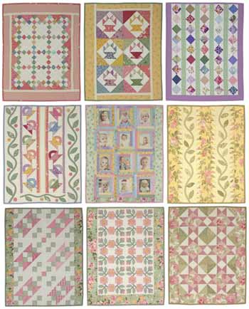
Color Basics
Even if you don't do traditional art or quilt, you still know something about color even if you don't readily recognize it. Think about it for a minute: what's your favorite color? Is there a color pairing you find yourself buying a lot of for your home or wardrobe? If you can dress yourself, then you can pick color. Most of us (People of Walmart not included) have a reasonably good idea of what colors look good on us (for me, jewel tones), what does nothing for us (for me, white and beige) and what looks downright God-awful (I'm looking at you, yellow). Women especially have a good idea of color because most of us at least ever now and then, wear makeup. We have to know if we have a warm or cool toned skin tone, if we're an "ivory, buff, beige, tan, olive, or ebony," which eyeshadow will make our blue/brown/green/hazel/grey eyes look more blue/brown/green/hazel/grey, and whether our lipstick will make our teeth look white or yellow based on whether the lipstick is yellow based or blue based. Guys, you know color too! You carefully select your tie to match your suit to match your hankercheif to match your shoes, your car's exterior to match the interior to match the speakers, your customizable video game and RPG characters to look the most menacing ro the most sage (you can't have an anti-Paladin in pink...that's not menacing and manly at all).
But just to review the color basics we all ready know...
Warm Colors - Red, orange and yellow are traditionally called the warm colors. Browns, tans, even some purples and blacks can be considered warm colors if they're red or yellow based. But that's overcomplicating it, and we'll get to that later. Warm colors all share their primary base of red. We know the warm colors give a more bright, energetic, alarming, cheerful feel to whatever they are covering.
Cool Colors - Traditionally, these are green, blue and purple. Grey, brown, black and beige can also be cool colors if they are blue or green based. Cool colors all share the primary blue base. These are called cool colors since when they are used, they evoke feelings of calmness, coldness, crispness and freshness that warm colors contrast with.
POP QUIZ! True or False: Black is all colors combined and white is the absence of color, so therefore there is only one black and one white - they're all the same. Read on for the answer...
Remember this? I think we all had to make our own version of this in grade school using too much tempera paint and glitter.
Hues
The above Color Wheel is showing the hues only. A hue is the pure color, meaning it is not mixed with gray, black or white to achieve darker, lighter, duller or brighter colors. You've probably also noticed that brown, grey, black and white are NOT shown on the Color Wheel. All of that I will explain later, but first, let's just focus on the hues.
Primary - The primary colors are the three that make up the very center of the Color Wheel; Red, yellow and blue. These three colors are the very base of all other colors, which means they also are the least complex (yes, even white and black are more complex than your primary red, yellow and blue. I'll get to the different types of the primaries later). These 3 colors are not the result of mixing any other colors, meaning you can't mix X and Y and get red for example.
Secondary - The colors are the result of mixing any 2 of the 3 primary colors; red + yellow yields orange, yellow+ blue yields green and blue + red yields violet. Secondary colors are still fairly pure, meaning they are the result of your most basic primaries, not dark red + light blue or anything like that.
Tertiary - These colors are a little more complex. I refer to these as the Crayola colors; these are the Violet-Reds, Red-Violets, Yellow-Greens, Blue-Purples...all of the least creatively named, yet prettiest (in my opinion) crayons of the Crayola 24 pack. These colors are achieved by mixing one primary color and one secondary color, so they end up being the "in-between" colors, not quite one or the other. This is one way to get your darks and brights of secondary colors.
How does knowing Hues help in quilting?
Knowing the hues helps a great deal. Think of the hue of the color as the foundation of your house. Your house needs a foundation to be built on, just like your quilt needs color to grow from. By knowing how a hue is built and where it sits on the Color Wheel, you can more easily choose the colors to go with it. Each hue has a built in set of colors it naturally looks nice with, both yielding different visual effects: the accompanying colors can either be Analogous or Complementary.
For the sake of example, let's say I am making a quilt and I have chosen a focus fabric that is predominantly violet:
Analogous - Analogous colors are the colors that are immediately next to each other on the Color Wheel, and are made up of one primary, one secondary and one tertiary. Sonce my focus fabric is purple, my analogous color set could either be red, red-violet and violet or blue, purple (aka blue-violet) and violet. Analogous colors in quilts create a softer, calmer more blended appearance (even if your focus is yellow)since they are all in the same color family.
Complementary - Complementary colors are the colors that are opposite each other on the Color Wheel. Looking at the above Color Wheel, you can see that Violet's complement is yellow. When you're dealing with hues, complementary colors are a pairing of one primary and one secondary, or a pairing of two tertiaries, depending on your color choice. In quilts, it is the Complementary pairings that give your quilt pop! The opposite colors make each other brighter and more intense, which gives your quilt a brighter and more dynamic quilt. Complementary colors can be expanded into analogous complemntary pairings in quilts, meaning you pair your focus analogous set (let's say red, red-violet and violet ) with their complementary analogous set (yellow, yellow-green and green). Using Complementary Analgous pairs gives you a wider range of color, while toning down the intensity of your complements, still gives your quilt what I call "the pop factor." If you mix two complemenatry colors together, however, you will get a muddy shade of grey-brown. This is useful if you need a brown that plays well with your complements.
Now we're going to get a little more complicated, because we'll combine the above principles with some new mixes of color. Expand your idea of the Color Wheel from that of the simple Hue Color Wheel you learned in grade school into what I call "The Paint Chip Color Wheel" that you'd learn in art school. This is where we bring in the lights, darks, brights and neutrals together into one Color Wheel, as illustrated below. Since we just went through Hues, we're going to skip those and dive right in:
The Truth About Black and White
True or False: Black is all colors combined and white is the absence of color, so therefore there is only one black and one white - they're all the same.
Answer: FALSE. While it is true that black is all colors combined and white is the absence of color, it is not true that all balcks and all whites are same. Both colors are actually multi-tonal.
Have you ever put on a black shirt and a black pair of pants, walked outside and had someone point out your shirt and pants didn't match? Though tactless, it was probably true. When it comes to fabrics, not every black is the same. Different companies used different types of dye with different base colors to make their black dye. Go into any quilt store and grab a few different brands of solid black; I guarantee you one will look warmer (red base) and one will look cooler (blue base) and one will look slightly greenish (green base). They're all black, but they have different bases. Dabbing some bleach on a piece of black fabric will show you what it's base color is if you have enough fabric to spare to test. Not only that, but because of their different bases, blacks come in a variety of shades evenwithout the addition of white: blue based blacks tend to be the darkest, and green based blacks tend to be lighter.
White functions a little differently. Think of it in terms of a white paint chip - there's bright white, soft white, eggshell white. They are all white and like black, unless you put 2 different whites together, its hard to tell the difference. In fabric, there is even something called "optic white," which is the white that is the brightest of them all. The softer whites work well in pastel quilts and in lanscape quilts where white is necessary. While still creating high contrast with other colors, it's not as stark as an optic white. Optic whites work nicely in more contemporary quilts and in quilts using brights. It creates the crispest line and the highest contrast. Natural light aids in determining what kind of white you have, since artificial (incandescent, fluorescent, LED etc) light can give fabric a slight cast of color it may or may not have on its own.
Tints
As you can see above, a Tint is the hue mixed with white. This is what we commonly refer to as the Pastel colors. The more white a hue is mixed with, the lighter and brighter the color becomes. This is also how we get our lightest of neutrals - cream, buff, beige - but I'll get to how we achieve our neutrals in a moment. Tints may also be mixed with other tints to creat new tints. Whew!

The same Warm/Cool, Analogous/Complementary (WC/AC Rules henceforth) apply to Tints as to Hues. Used alone, Tints provide quilts with a very soft, light, gentle, feminine look and feel, regardless of texture. These are perfect colors for baby, spring, winter, shabby chic, and girly girl quilts. When accompanying other non-Tint colors, they traditionally are used as backgrounds or to give the impression of light.
Examples of quilts using Tints. Tints don't have to be baby pastel, it just depends on how much white is present in the hue that determines how pastel it reads. Picture courtesy of Lori Smith of From My Heart to Your Hands
Tones
Tones are hues mixed with gray. Gray is not a tone; keep in mind that gray is white + black, which makes it technically a tint, and black is multi-colored. That means that since there are just about endless colors of gray (sounds odd, colors of gray, doesn't it?) because of the different blacks the white could get mixed with, Tones actually have a deceptively broad range of color. Depending on who you talk to, this is where you'll find your Neutrals. I disagree there, since not all (in fact, to my eye, not most) Neutrals are mixes of gray - they are more complex than that.
 Tones - Hue to the left, tone to the right. Courtesy of Tiger Color
Again, the same Warm/Cool, Analogous/Complementary (WC/AC Rules henceforth) apply to Tones as well. Tones make for great additions to masculine quilts, and are extremely useful in creating shadow and depth for landscape quilts. They also offset bright colors very well, and give those colors a "glowing" effect. Tones are also prevalent in Primitives and reproduction style quilts.
Again, the same Warm/Cool, Analogous/Complementary (WC/AC Rules henceforth) apply to Tones as well. Tones make for great additions to masculine quilts, and are extremely useful in creating shadow and depth for landscape quilts. They also offset bright colors very well, and give those colors a "glowing" effect. Tones are also prevalent in Primitives and reproduction style quilts.
This is an example of a tonal/neutral quilt. The focus is gray, taupe and brown, with taupe being the prime example of a Tonal color (brown + gray). Photo courtesy of Quilts in Montana.
Shades
"Shade" is a word we use colloquially to denote the different colors within a color (shades of pink, shades of blue etc) that aren't necessarily dark, light or mid-tone. However, in Color Theory, a shade is a color that is mixed with black, making it the dark version of that color. Just like with Tones, because black is multi-colored, the effect can be whide ranging, from intensifying it to a dark, rich color (for example, mixing red with a red-based black), or to counteract the warmness/coolness of it (for example, mixing a red with a green based black). Shades can range from just slightly darker than mid-tone, to almost black, depending on how much black is mixed with the original color, but generally they are referred to as "dark [color of choice]."

Shades are great for pairing with brighter colors to make them pop, or pairing with other shades to create a sense of depth and richness. They work very well in masculine quilts and contemporary quilts, and are prevalent in reproductions and Primitives.
Shades - Hue to the left, shaded to the right. Courtesy of Tiger Color
Shades are great for pairing with brighter colors to make them pop, or pairing with other shades to create a sense of depth and richness. They work very well in masculine quilts and contemporary quilts, and are prevalent in reproductions and Primitives.
This is a good example of shades and tonals. The lighter pieces are a tonal (taupe-gray) and the rest are shades of red, blue, rust and looks like green too. The quilt is beautifully rich. Picture courtesy of Heather Pearson's Blog.
Making Color Work FOR You
Choosing color for your quilt is not a scary as it can be made out to be. Thankfully, unlike paint, if you don't like a color you put in, or if it just doesn't work, you can take the piece out and put a new one in relatively easily. But a good rule of thumb is to start with a focus fabric that will be prevalent in your quilt, from which you can choose accompnying colors. Sometimes it's obvious which colors you want to put with your piece, and it's a snap and you get your colors picked in 5 minutes or less. They work great, and Voila! Successful quilt. This is more for when you have a focus fabric, or a set of colors you think you awant but are stumped as to what to put with it.
First, there are a couple things to consider. What kind of fibers will you be working with - cotton, batiks, flannel, wool, silk, wovens, etc? This is important to consider since some fibers absorb dye differently. Batiks and cottons tend to be more saturated with dye, and so they run the gamut from pastel to bright to dark with ease. Flannels can be bright, but more often than not you'll find darker, more muted colors or very soft pastel colors. Wool comes in all colors, but darker and brighter colors are more prevalent. Wovens tend to be more neutral and tonal.
Another question to ask yourself is, what do you want to achieve with your quilt? That will help determine your color selection. If you are looking to make a comfort quilt, you might shy away from the brighter, more intense colors and opt for something softer and more soothing. If you are looking to do something more contemporary, you might look more into the brights and tonals. If reproduction is your thing, you might seek out deeper and more tonal fabrics. Pastels are more suited for shabby chic, spring and baby quilts, so you might consider pastels for something like that. THERE IS NO HARD AND FAST RULE AS TO WHAT IS THE "RIGHT" COLOR FOR THE JOB. I cannot emphsize that enough! There are no Quilt Police that will haul you away for doing a baby quilt in tonals, a reproduction in pastels or a traditional quilt in brights. Consider who you're making it for, and what they like and what purpose it will serve. Everyone has a different eye and likes different things so COLOR CHOICE IS SUBJECTIVE. It's no fun if theres stress and anxiety over what's the correct color for the jo, it's all about what flows and looks good to your eye and Color Theory helps you get there. I digress :)
Here's a breakdown of colors and the effects they acheive on their own. When you combine them in certain ways, they bounce off each other differently:
Red: An active color, red will pop out from darker, cooler colors. It has warm intensity and brings to mind things like fire, love.
Orange: Also an active color, it pops from darker, cooler colors as well. It is warm and bright and gives quilts a happy, sunny, energetic feel.
Yellow: An active and intense color that will pop against any other, even warm colors. It is warm, crispand vibrant. the eye cannot focus on yellow for very long, so placing pops of yellow in a quilt forces the eye to move around the piece. It also gives quilts a cheerful and sunny feel.
Green: This is generally a more passive color that retreats when placed with warmer colors, but if the hue/tint is bright enough, it can pop depending on what it is placed with. Green helps give quilts a fresh, clean and calm ambiance.
Blue: Unless it is a very bright blue paired with other cool colors, blue is a passive color that retreats in the background. It will give your quilt a tranquil feel no matter the shade, and in the tonals it grounds the piece. Blue can be vibrant and energetic, but overall it is a calming influence.
Purple: As with green, the intensity and brightness of purple can change whether it pops or retreats. Generally though, it retreats and gives the quilt a fresh, feminine, or rich and regal feel.
Neutrals: I'm going ot go ahead an use this umbrella term for browns, grays, beiges, taupes, tans, creams and everything inbetween. Neutrals tend to recede because they are mostly paired with a more dominant color. They give quilts a calm, earthy simple beauty.
White: White quickly dominates a quilt, but if used too much it has a tendency to overpower the colors it's paired with. Colors appear less bright with white with them, but also appear fresher and clearer than with black, as seen below:
Black: As seen above, black makes other colors, including white, pop. Because of its darkness, it dominates a quilt. visually while still letting other fabrics be the stars.


Here are some color choice tips to consider...
* Depending on what you choose to use as a background, the color you use on top of it may look different because of how the two colors play together based on where they are located on the color wheel. For example:The center block in each square is the same red, but look how different it can look based on what you pair with it? Courtesy of Color Matters
Again, the center block is the same purple, buyt even with analogous colors, the focus color can seemingly change based on your background. Courtesy of Color Matters
* Color is important, but value is even moreso. You can have all of the range of color in the world but still have a flat quilt if it's all the same tint/tone/shade. Quilts need light, medium and dark fabrics to create depth. that doesn't mean every quilt needs black and white, but in whatever colors you choose, having both ends of the spectrum as well as the mid tone helps create richness, depth and that "Pop Factor" that quilters love.
* Cooler, darker colors tend to recede when places with brighter, warmer colors. If you want a portion of your block to pop, consider using the brighter complement as the focus of that block.
* Monochromatic (using the hue, tints, tones and shades of one color only) quilts are nothing to sneeze at. While only using one color, the value is what makes the quilt so visually impactful.
* Proportion of color and value is what gives your quilt its life - The dominant color is both the color you use the most of, or what your eye is drawn to quickest. Your sub-dominant colors are the colors that take up less area than the dominant color, but play well with the dominant. The accent is the color that takes up the least space, but contrasts the most with the sub-dominant and dominant color(s). Divinding your color choices into those groups can help organize and guide the direction of your quilt. Without stating it outright, most quilt patterns do this for you on the required yardage page.
* This Palette Picker is a great help to illustrate how your colors will interact if you're having a hard time visualizing. It's come in handy for me more than once!
This article has been supplemented by this Color Theory website. If you want to learn even more, this is the best, most in-depth tutorial I have found yet
Subscribe to:
Posts (Atom)